
Preview image. Unlock full-res
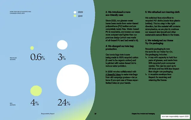
Color-proportion guidance for parent communications, shown as a large donut chart dominated by soft sky-blue tones for a calming feel.
Summary
The parent-audience counterpart to the professionals chart: a donut weighted toward soft sky-blue and light tones to create a calming, supportive atmosphere.
Visual description
Two-column layout matching slide 43. Left: teal eyebrow "COLOR", serif heading "Color Proportions for Parents" over two rows, and a grey paragraph advising softer, soothing colors with an emphasis on Sky blue. The right two-thirds holds a large donut (ring) chart whose segments lean heavily on pale sky and light-mist arcs across the top and right, with a navy wedge plus smaller slate, gold, dark-sky and sky wedges along the bottom. A page number "1" sits bottom-left. Vertical "Brand Guidelines" label and spark mark on the left edge.
Key takeaway
Reusing the identical donut template from the professionals page but re-weighting the segments toward a different signature color, so the two audiences feel distinct while sharing one visual system. Same chart, different emotional temperature.
Reuse notes
Use alongside slide 43 as a paired set demonstrating audience-driven color balance. The matched layout is the point: keep the chart structure fixed and only change which colors dominate. Good reference for products with both end-user and professional audiences.
From this deck: Color Proportions for Parents donut
View deck






































































More like this






Keep what you find
A free account saves references to boards and can send you a weekly email of picks based on what you save.
To see every result, go Pro.