
Preview image. Unlock full-res
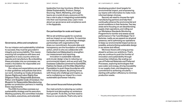
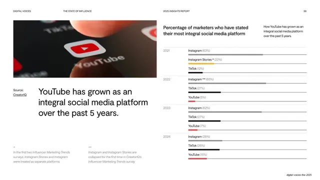
Split data spread with running body copy left and a tall grouped bar chart of Vietnam Tier 1 wages right, anchored by two oversized percentage stats.
Summary
A two-part report spread: dense serif body copy on a white left page, and a large lavender data panel on the right holding a grouped bar chart of supplier wages plus two huge percentage stats.
Visual description
A running header in tiny all-caps sits across the top (report name left, "SOCIAL IMPACT" center-left, "SUPPLY CHAIN PARTNERS" center-right, page number right). The left two columns carry small serif body copy under bold subheads ("Human rights policy", "Progress on living wages") with a footnote rule at the bottom. The right half is a soft lavender (#D8CBD6) full-height panel: a serif headline up top, then a tall vertical bar chart with a $0-$400 axis and monthly bars labeled 01-10 plus 2023/2024, each annotated with dollar figures and two percentage rows beneath. Below the chart, two oversized stats ("100%", "90%") sit over short captions. A small "on-impact-progress-2024" label sits bottom-right.
Key takeaway
The device of giving the chart its own tinted full-height panel so it reads as a distinct exhibit against the plain text page. Closing the data page with two oversized takeaway percentages turns a dense chart into a memorable headline.
Reuse notes
Strong template for the data-heavy middle of an ESG, annual, or investor report where one page must hold both narrative and a chart. The color panel does a lot of work to separate quantitative from qualitative content; pick a tint that stays subordinate to the ink.
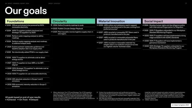
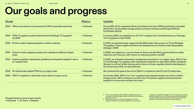
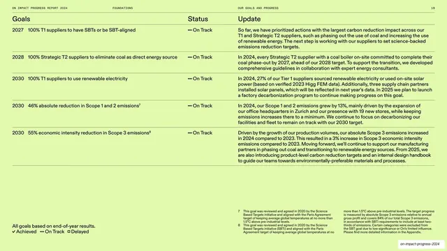
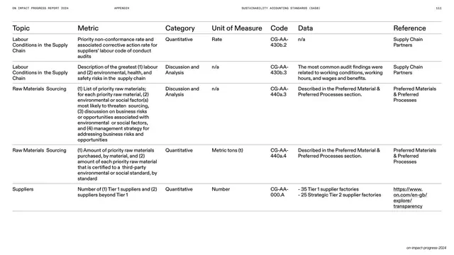
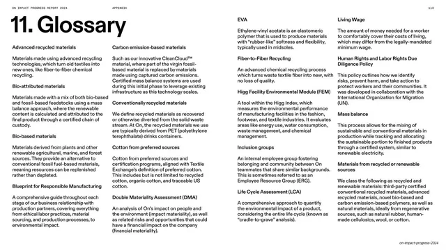
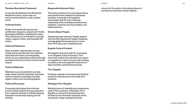
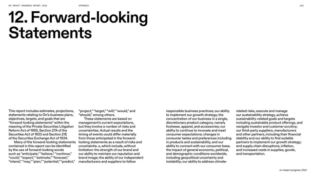
From this deck: Vietnam Tier 1 wages benchmark bar chart
View deck













































More like this





Keep what you find
A free account saves references to boards and can send you a weekly email of picks based on what you save.
To see every result, go Pro.