
Preview image. Unlock full-res
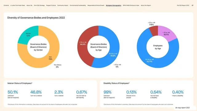
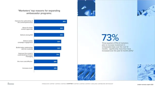
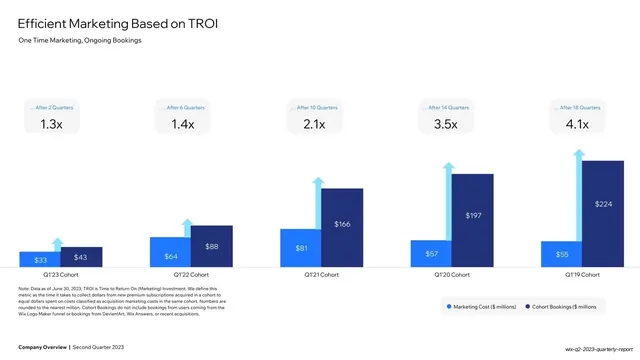
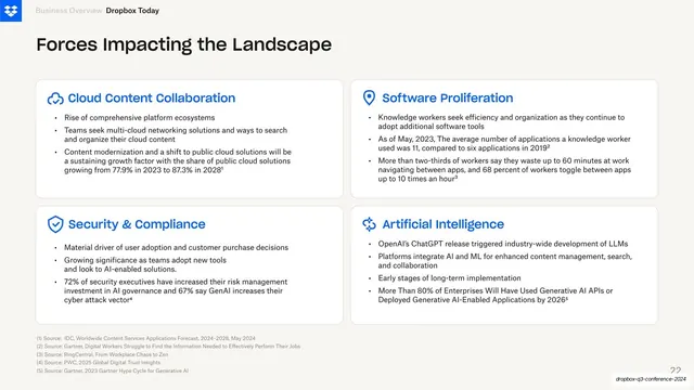
A figure slide with a left explainer, a donut chart of fine incidence (31% vs 69%), and a five-bar column chart of fine-amount distribution.
Summary
A two-chart figure slide: a left narrative explainer, a donut chart showing the 31%/69% split of organizations that incurred fines, and a five-column bar chart distributing those fines by dollar band.
Visual description
White slide, "02 / Complete findings" header. The left column is a body paragraph led by a bold "Figures 32 and 33." The middle holds a donut chart on a pale grey panel titled "Did your organization incur any fines from the data breach?", split into a navy 31% wedge and a violet 69% wedge with an inline legend. To its right, a second grey panel carries a vertical bar chart, "Distribution of cost of fines incurred from a data breach," with five blue columns (15%, 19%, 25%, 21%, 20%) across dollar-band categories and a percentage y-axis. Figure captions sit below each panel.
Key takeaway
The recurring grey-panel-per-chart device that visually boxes each figure and lets two different chart types (donut + column) sit together without clashing. Navy-plus-violet for a two-part donut keeps it on the deck's tight palette.
Reuse notes
A clean layout for "how many, and how much" pairs: one chart for incidence, one for distribution. The panel backgrounds make it easy to drop into a report grid. Reuse the navy/violet donut and blue column conventions for palette consistency across the deck.
From this deck: Fines incidence and distribution figures
View deck











































































More like this





Keep what you find
A free account saves references to boards and can send you a weekly email of picks based on what you save.
To see every result, go Pro.