
Preview image. Unlock full-res
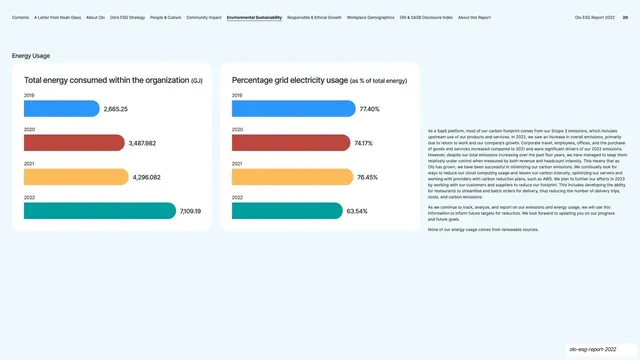
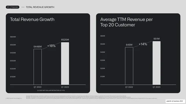
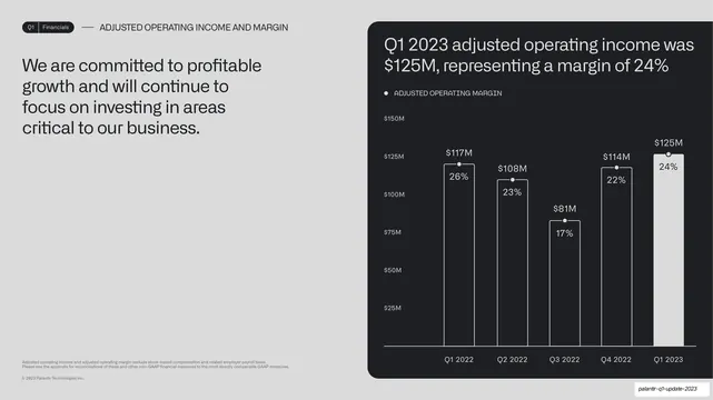
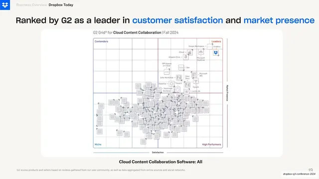
A figure slide with a left explainer and a right panel holding a grouped vertical bar chart comparing 2022 and 2023 mega-breach costs across six record-size cohorts.
Summary
A single-chart figure slide: a tall left explainer paragraph beside one grey panel holding a grouped column chart that sets 2022 against 2023 mega-breach costs across six record-size cohorts.
Visual description
White slide, "02 / Complete findings" header. The left column is a long body paragraph led by a bold "Figure 37" headline. The right two-thirds is a pale grey panel with a grouped vertical bar chart titled "Cost of a mega breach by number of records lost." Six category groups (1M-10M up to 50M-60M) each pair a light violet 2022 bar with a blue 2023 bar, every bar labeled with its dollar value (e.g. $49/$36 up to $387/$332) over a $0-$400 axis. A two-swatch year legend sits below, with the figure caption beneath.
Key takeaway
The light-violet-versus-blue paired columns as a clean year-over-year comparison: muting one year and saturating the other makes the "before/after" obvious at a glance, and labeling every bar removes axis guesswork. Boxing the whole chart in a grey panel matches the deck's figure system.
Reuse notes
A go-to for any two-period comparison across several categories. Keep the muted/saturated pairing consistent so older data always recedes. Suits research, financial and benchmarking decks. Six groups is near the upper limit before bars get cramped at 16:9.
From this deck: Mega breach cost by record cohort figure
View deck











































































More like this




Keep what you find
A free account saves references to boards and can send you a weekly email of picks based on what you save.
To see every result, go Pro.