Preview image. Unlock full-res
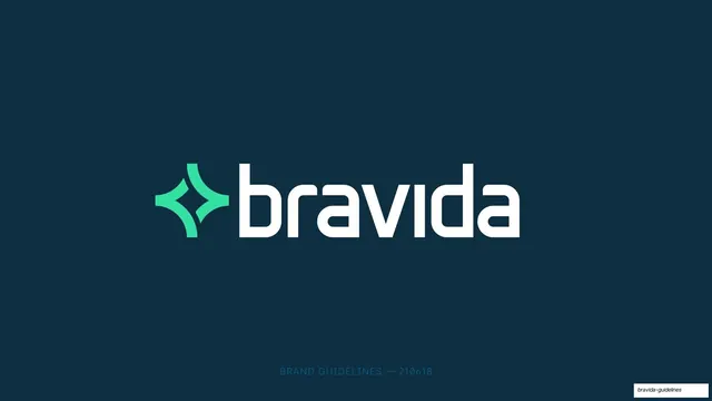
A 123-page corporate brand guideline for Bravida built on a Bravida Blue and Bravida Green palette, light-weight Inter typography, a recurring label-left content-right grid, and a custom four-point sparkle symbol whose rounded curve becomes a graphic motif.
Summary
A 123-page brand guideline for Bravida, a Nordic technical-installation and building-services company. Its identity rests on two primary colors (Bravida Blue and Bravida Green), the Inter typeface used in light weights, a strict label-left content-right grid, and a custom four-point sparkle symbol whose concave rounded edge is reused as a quarter-circle graphic device across layouts.
Visual description
Pages run 16:9. The system is built on Bravida Blue (#006390) and Bravida Green (#34E0A1) against white and a near-black navy, with a small set of supportive tints (light blues, a soft pink). The cover centers the full logo, a green four-point sparkle plus a lowercase white "bravida" wordmark in a rounded geometric sans, on a deep navy field with a single tracked all-caps metadata line at the foot. The typeface is Inter, specified from Extra Light through Semibold, with light weights set large for headlines and section lists. The dominant content layout is a two-column grid: a small dark-on-white section title and running body copy in the left column, the demonstrated asset (logo, color block, photo, icon set, mockup) filling the right. Section dividers and table-of-contents pages put a large light-weight list of chapter names and page numbers on a solid Bravida Blue field, with a green sparkle anchored top-right. A persistent footer carries a small "2021" bottom-left and a "BRAVIDA" running mark bottom-right. The sparkle symbol's rounded concave corner recurs as a large quarter-circle that softens one edge of full-bleed color panels. Photography is journalistic and desaturated, shot in natural light, full-bleed on the right half. Icons are thin single-weight blue line marks inside circles on a pale blue ground. The deck covers logo, symbol, color, typography, photography, graphic format, illustration and charts, icons, tagline ("We bring buildings to life"), area of expertise, sustainability (a green sub-system), and applications (workwear, vehicle livery, stationery, advertising templates, web banners, motion graphics, social media, PowerPoint, signage and stickers).
Key takeaway
The discipline of a fixed label-left content-right grid that holds across 120-plus pages so every spec reads the same way. The way one brand asset, the sparkle symbol, is decomposed into a reusable graphic device (its rounded corner becomes a quarter-circle panel cut), giving the whole system a signature shape without extra decoration. And the restraint of building an entire identity on two colors plus light-weight Inter, letting full-bleed color fields and journalistic photography carry the energy.
Reuse notes
A strong reference for corporate, industrial, B2B, or technical-services brand guideline decks, and for any long identity document that must stay legible and consistent across many chapters. The label-left content-right template, the solid-color section dividers with a corner mark, and the running 2021 / brand footer are directly reusable. The light-weight Inter headline treatment depends on large sizes and ample white space to read as premium rather than thin; it weakens at small sizes. The blue-and-green palette and sparkle motif are specific to Bravida; swap them for your own marks and brand colors.
From this deck: Bravida Brand Guidelines 2021
View deck

























































































































More like this









Keep what you find
A free account saves references to boards and can send you a weekly email of picks based on what you save.
To see every result, go Pro.