
Preview image. Unlock full-res
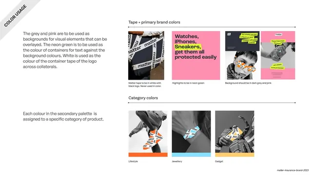
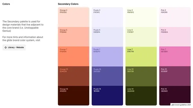
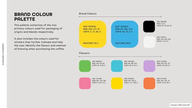
Color page listing the primary palette (grey, pink, white, neon green) and a secondary palette (orange, blue, yellow) as labelled swatch blocks.
Summary
The palette page: a primary set (slate grey, pink, white, neon green) and a secondary set (orange, blue, yellow) laid out as labelled color blocks with hex and CMYK values, introduced by left-hand body copy.
Visual description
A white full-bleed slide with a rotated "COLORS" ribbon in the top-left corner. The left column holds two short General Sans paragraphs describing the primary colors (grey, pink, white, neon green as a highlight) and the secondary palette (orange, blue, yellow) used to differentiate product categories. The right side stacks the swatches under thin "Primary Palette" and "Secondary Palette" labels: a tall slate-grey block (HEX 2F323A), a pink block (FF8FAF), then a white block (FFFFFF, outlined) beside a small neon-green block (DDFC2C); below, three full-width secondary blocks in orange (FF6827), sky blue (88E0FF) and warm yellow (FFCD6E). Each swatch carries small in-block HEX and CMYK text.
Key takeaway
Splitting the palette into a primary set plus a functional secondary set whose job is stated (category differentiation), so color choices read as decisions, not decoration. Giving the rare neon green a small block signals it is a highlight, not a field color.
Reuse notes
A clear palette-page template, reusable for any brand. Stating the role of the secondary palette is the transferable move. Note the CMYK values shown appear placeholder-identical across swatches, so the page is for hex reference rather than print specs.
From this deck: Primary and secondary color palette
View deck















More like this





Keep what you find
A free account saves references to boards and can send you a weekly email of picks based on what you save.
To see every result, go Pro.