Preview image. Unlock full-res
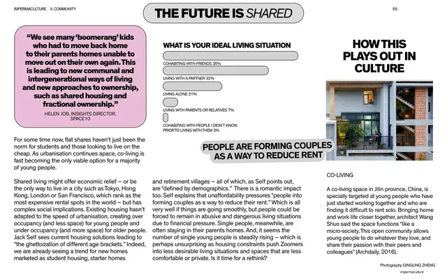
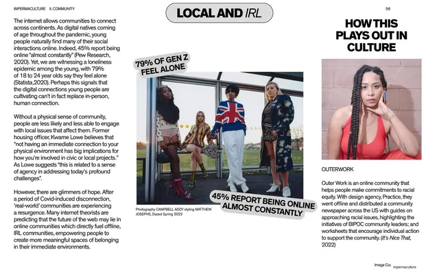
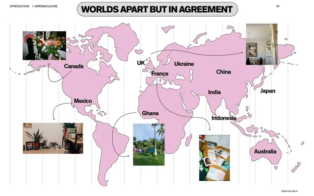
Pink world map titled "Worlds Apart But In Agreement" with country labels and photo snapshots of homes connected by hand-drawn arrows.
Summary
A flat pink world map used as an infographic: bold country labels plus small photographs of people's homes from around the globe, tied together by loose hand-drawn arrows.
Visual description
Light background with faint vertical guide lines, 16:9. A rounded grey-outlined pill at the top center holds the all-caps title "WORLDS APART BUT IN AGREEMENT"; the running header "INTRODUCTION 1. IMPERMACULTURE" and page number "18" frame it. The continents are filled flat bubblegum pink with a thin dark outline. Black bold sans labels name countries (Canada, Mexico, UK, France, Ukraine, China, India, Japan, Ghana, Indonesia, Australia). Five small photographic thumbnails of domestic interiors and scenes are scattered over the map and joined to their countries by thin curved hand-drawn arrows. A small italic "impermaculture" footer sits bottom-right.
Key takeaway
Turning a single flat-color map into the whole layout, then layering real photo thumbnails and casual hand-drawn arrows over it. The mix of a rigid pink silhouette with loose marker arrows makes data feel human and editorial rather than corporate.
Reuse notes
Good for any global-survey or "voices from around the world" moment in a report. The flat single-color landmass plus hand-drawn connectors is an easy, reusable infographic style. Keep label density low so the map stays readable; needs decent thumbnail crops.
From this deck: World map with global home snapshots
View deck