Preview image. Unlock full-res
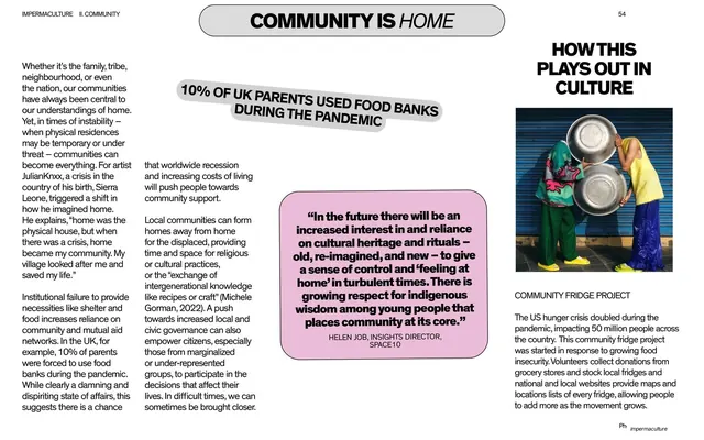
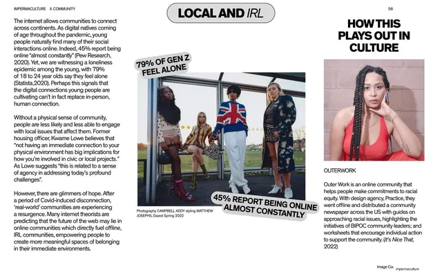
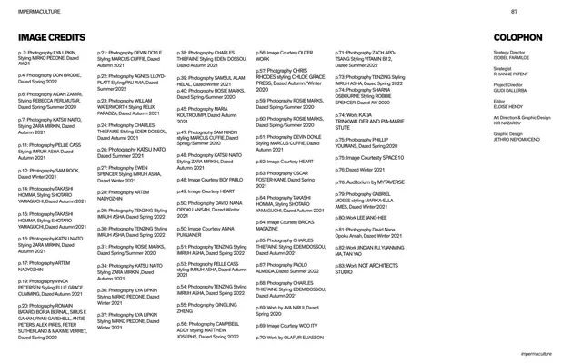
A dense editorial text spread under a pill-shaped chapter title, with a warped stat callout, a pink quote block, and a right-hand culture sidebar showing a community fridge photo.
Summary
A reading spread carrying the chapter's argument in two body columns, punctuated by a tilted bold stat, a pink serif quote block, and a right rail headed "HOW THIS PLAYS OUT IN CULTURE" with a supporting photo and caption.
Visual description
A centered black pill badge holds the title "COMMUNITY IS HOME" (roman + italic). Below sit two columns of small black body copy. A warped, slightly 3D all-caps callout ("10% OF UK PARENTS USED FOOD BANKS DURING THE PANDEMIC") is pasted across the top of the columns. A pink rounded rectangle carries a serif quote attributed to "HELEN JOB, INSIGHTS DIRECTOR, SPACE10". The right page is a separate column: a bold "HOW THIS PLAYS OUT IN CULTURE" heading, a photo of two people holding stacked metal bowls, a small caption ("COMMUNITY FRIDGE PROJECT"), and a paragraph. Running header top left, page number top right, "impermaculture" tag bottom right.
Key takeaway
The repeatable three-part page system: pill chapter title, a body argument with a tilted stat sticker for emphasis, and a fixed right-hand "how this plays out in culture" sidebar that grounds the theory in a real example. The pink quote panel breaks the gray text without adding a new typeface.
Reuse notes
Ideal for long-form research or trend reports that must stay readable across many text-heavy pages. The recurring culture sidebar is the reusable move; keep its position fixed so spreads feel like a series. Needs disciplined copy lengths to avoid overflow.
From this deck: Community is home text spread with culture sidebar
View deck

































More like this







Keep what you find
A free account saves references to boards and can send you a weekly email of picks based on what you save.
To see every result, go Pro.