Preview image. Unlock full-res
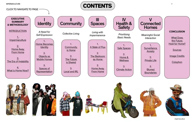
Table of contents laid out as seven pink rounded columns of clickable chapter links, with a row of cut-out fashion figures along the bottom.
Summary
An interactive table of contents built from seven baby-pink rounded columns of underlined chapter links, anchored by a row of cut-out figures along the bottom edge.
Visual description
White background. A white capsule label reading "CONTENTS" sits centered at the top, with "IMPERMACULTURE" as a small running header top-left and a page number top-right. A handwritten-style note "CLICK TO NAVIGATE TO PAGE" with an arrow points to the first column. Below run seven tall baby-pink rounded-rectangle columns, each headed by a chapter title (Executive Summary & Methodology, I Identity, II Community, III Spaces, IV Health & Safety, V Connected Homes, Conclusion) with a short italic subtitle and a stack of numbered, underlined sub-links inside. Roman numerals head the five numbered chapters. Along the very bottom, a row of cut-out photographic figures (skaters, a streetwear group, costumed figures, a scooter rider) stands on the white, captioned as people but framed as decorative anchors.
Key takeaway
Turning a contents page into a navigable interface: pink capsule columns of underlined links read as buttons, and the explicit "click to navigate" cue signals interactivity. The bottom band of cut-out figures grounds an otherwise abstract index with the report's human subject.
Reuse notes
Reach for this when a long report's contents page can double as a clickable menu (PDF or web export). The column-per-chapter structure scales to five to eight sections cleanly. Needs good cut-out photography for the bottom band; without it the white space below the columns reads empty.
From this deck: Impermaculture interactive contents
View deck