Preview image. Unlock full-res
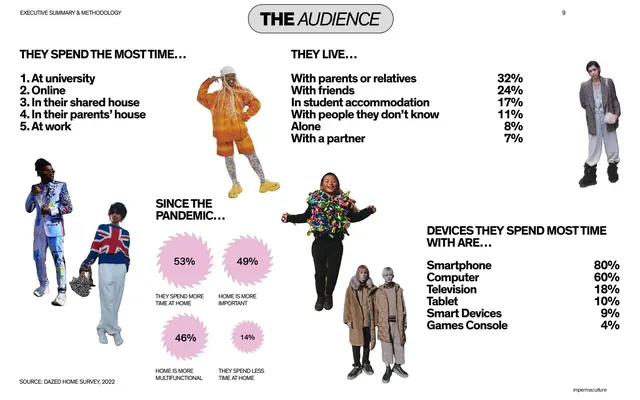
An audience-profile spread mixing ranked lists, right-aligned percentage tables, and pink percentage starbursts, set among scattered cut-out figures.
Summary
The audience-profile spread: ranked lists and right-aligned percentage tables describing where young people spend time, live, and what devices they use, dotted with pink stat starbursts and cut-out figures.
Visual description
White background with a centered white capsule label "THE AUDIENCE" at top. The upper-left holds a numbered ranked list ("THEY SPEND THE MOST TIME..."); the upper-right a list of living situations with right-aligned percentages set in large type (32%, 24%, 17%...). Lower-right repeats the device share the same way (Smartphone 80%, Computer 60%...). A "SINCE THE PANDEMIC..." cluster in the center uses four spiky pink starburst badges holding percentages (53%, 49%, 46%, 14%) with captions beneath. Several full-color cut-out figures stand among the data on the white field. A source line sits bottom-left.
Key takeaway
Setting list-with-percentage data in oversized type with the numbers flush right so they form a readable column, then breaking the rhythm with pink starburst badges for a few hero stats. The cut-out figures keep a data-heavy page from feeling like a spreadsheet.
Reuse notes
A strong template for an audience or survey-results page with several small data sets. The flush-right big-number list is very legible and reusable. The starburst badge is a playful accent; use it for two to four standout figures, not everything, or it loses impact.
From this deck: The audience stats with cut-out figures
View deck

















































More like this








Keep what you find
A free account saves references to boards and can send you a weekly email of picks based on what you save.
To see every result, go Pro.