Preview image. Unlock full-res
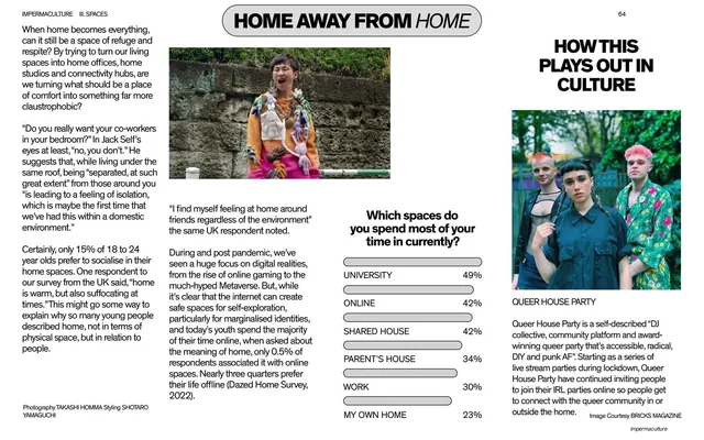
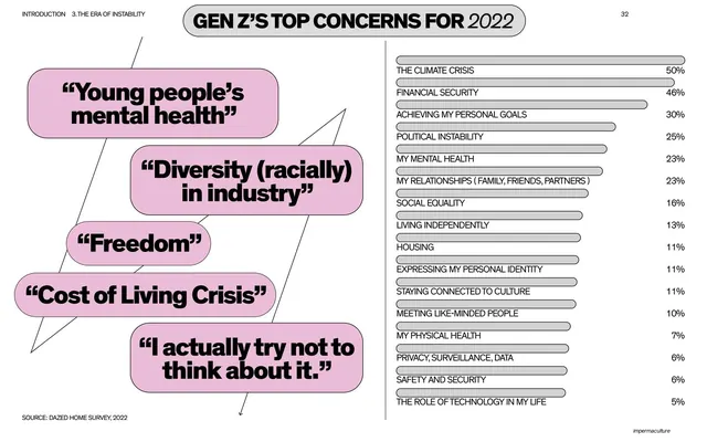
A text-and-data spread under a pill title with a three-column body, a labeled bar chart of where youth spend time, and a Queer House Party culture sidebar.
Summary
A spread on where young people actually spend their time, combining a three-column body argument with a centered labeled bar chart and a culture sidebar on Queer House Party.
Visual description
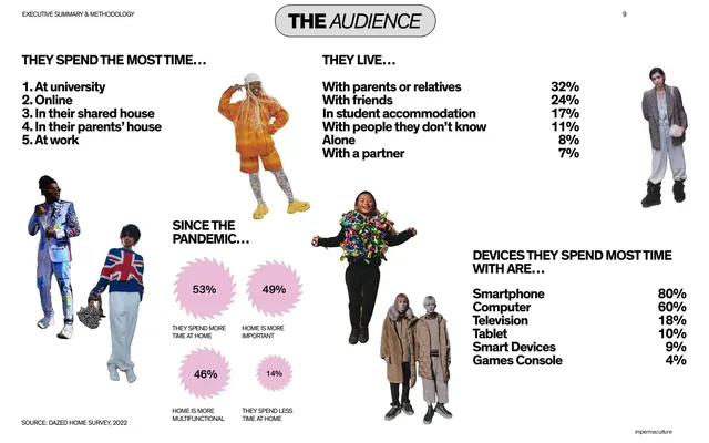
Pill title "HOME AWAY FROM HOME". The left two-thirds is a multi-column body, opening with a Jack Self quote woven into the copy. Centered is a "Which spaces do you spend most of your time in currently?" bar chart with all-caps labels and percentages (University 49%, Online 42%, Shared house 42%, Parent's house 34%, Work 30%, My own home 23%). The right page is the culture rail: "HOW THIS PLAYS OUT IN CULTURE", a group photo of three people, a "QUEER HOUSE PARTY" caption, and a paragraph. Running header, page number, "impermaculture" tag.
Key takeaway
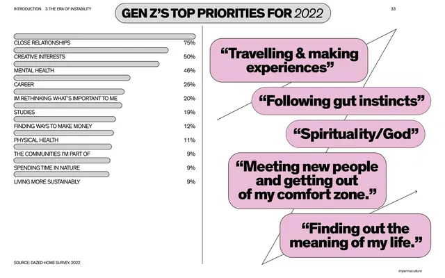
A multi-row labeled bar chart placed at the center of a text spread, ranking many options in one quiet monochrome graphic that stays inside the editorial grid. The fixed culture sidebar again pins the data to a real-world community.
Reuse notes
Use for any single survey question with five or more ranked options. Reuse the centered bar-chart-plus-body arrangement and the recurring culture rail. Keep the chart grayscale and label-led so it integrates with the page rather than reading as an infographic insert.
From this deck: Home away from home spread with time-spent chart
View deck











More like this



Keep what you find
A free account saves references to boards and can send you a weekly email of picks based on what you save.
To see every result, go Pro.