Preview image. Unlock full-res
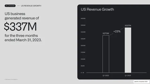
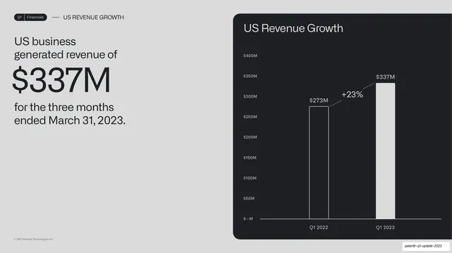
An oversized "$337M" statement on the left and a two-bar US revenue growth chart with a dotted +23% callout in a dark card on the right.
Summary
A US revenue slide built around an oversized "$337M" on the left and a two-bar year-over-year growth chart with a dotted "+23%" callout on the right.
Visual description
A light grey slide. Running header reads "Q1 | Financials" and "US REVENUE GROWTH". The left column reads "US business generated revenue of" above an enormous dark "$337M", then "for the three months ended March 31, 2023" below, so the number itself is the headline. The right is a rounded near-black card titled "US Revenue Growth" holding two vertical bars, Q1 2022 ($273M, outlined) and Q1 2023 ($337M, solid white), with a dotted line and "+23%" growth callout arcing between their tops. Y-axis labels run in small monospace.
Key takeaway
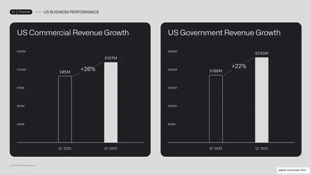
Letting one giant number be the entire left column while the bar chart proves it on the right. The outlined-then-solid bar pair plus a dotted percent callout is a compact, repeatable way to show year-over-year growth.
Reuse notes
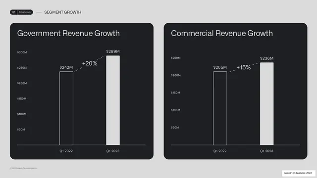
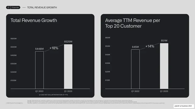
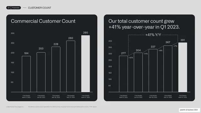
A high-impact pattern for a headline metric, the oversized figure carries the slide and the two-bar chart supplies evidence. Reuse the outlined-vs-solid bar convention across all comparison charts for consistency. Works on light or dark by inverting the bar fills.
From this deck: US revenue $337M big-number bar chart
View deck








More like this







Keep what you find
A free account saves references to boards and can send you a weekly email of picks based on what you save.
To see every result, go Pro.