Preview image. Unlock full-res
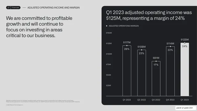
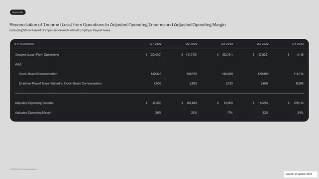
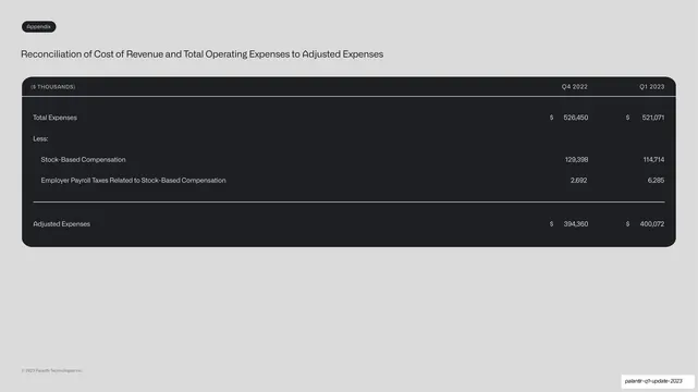
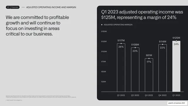
A headline-left, chart-right slide with an adjusted-operating-income bar chart in a dark card, each bar carrying its margin percentage, peaking at $125M / 24%.
Summary
A financial slide: takeaway at left, and a dark-card combo chart at right where each adjusted-operating-income bar also carries its margin percentage, peaking at $125M / 24%.
Visual description
Light-grey background, "Q1 | Financials" pill tab and "ADJUSTED OPERATING INCOME AND MARGIN" label up top. The left column carries the statement in dark grotesque: "We are committed to profitable growth and will continue to focus on investing in areas critical to our business." At right, a near-black rounded card titled "Q1 2023 adjusted operating income was $125M, representing a margin of 24%" holds a five-bar series ($117M, $108M, $81M, $114M, $125M) with a small dot marker and a margin percentage (26%, 23%, 17%, 22%, 24%) printed inside or atop each bar, the final bar filled white. A small monospace legend reads "ADJUSTED OPERATING MARGIN".
Key takeaway
The combo treatment of showing an absolute value as the bar and its ratio (margin) as an overlaid figure on the same bar, so dollars and percentage live together without a second axis. The final bar filled white keeps the current quarter the hero.
Reuse notes
Reuse for any metric that pairs an amount with a rate (income and margin, revenue and growth, spend and efficiency). Printing the percentage on the bar avoids a confusing dual-axis chart. Fits the same headline-left / chart-in-card template as the rest of the section.
From this deck: Adjusted operating income combo chart
View deck




More like this




Keep what you find
A free account saves references to boards and can send you a weekly email of picks based on what you save.
To see every result, go Pro.