Preview image. Unlock full-res
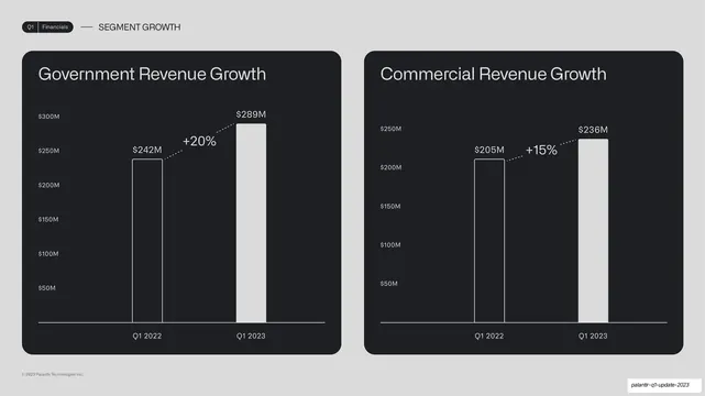
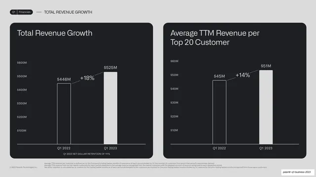
Two side-by-side dark cards comparing global Government (+20%) and Commercial (+15%) revenue, each a two-bar year-over-year chart.
Summary
A two-up segment comparison at the global level: two equal dark cards, Government Revenue Growth (+20%) and Commercial Revenue Growth (+15%), each a two-bar year-over-year chart.
Visual description
Light-grey background, "Q1 | Financials" pill tab and "SEGMENT GROWTH" label up top. Two equally sized near-black rounded cards sit side by side. The left card "Government Revenue Growth" shows an outlined $242M (Q1 2022) and a filled white $289M (Q1 2023) joined by a dotted "+20%" connector; the right card "Commercial Revenue Growth" shows $205M rising to $236M with a "+15%" connector. Same axis-label and bar treatment in both.
Key takeaway
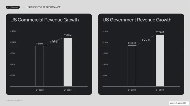
The repeated two-up card template, used again for the global split, reinforcing that a consistent comparison chassis can carry slide after slide. Pairing this global cut directly after the US cut lets the reader compare the two views by structure alone.
Reuse notes
Reuse as part of a sequence of comparison slides where keeping the exact same layout is a feature, not a limitation. The matched bar style makes adjacent slides feel like one continuous data story. Good for segmented revenue, geographic splits, or before/after metrics.
From this deck: Global government vs commercial revenue two-up
View deck




More like this



Keep what you find
A free account saves references to boards and can send you a weekly email of picks based on what you save.
To see every result, go Pro.