Preview image. Unlock full-res
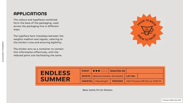
Light-grey page explaining how type works on stickers, with an orange sunburst stamp top-right and a wide orange "ENDLESS SUMMER" informational sticker below.
Summary
An applications page showing how Basic Gothic Pro works on the informational stickers, demonstrated with an "ENDLESS SUMMER" sticker.
Visual description
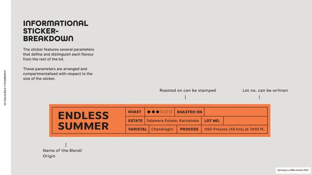
Light-grey (#F5F4F2) ground, vertical edge label. Top-left, a bold "APPLICATIONS" heading and three short paragraphs about the typeface interplaying medium and regular weights and the sticker acting as a container for the information. An orange sunburst stamp (a smiling-cup icon, "PAUSE TO BREW / BREW TO PAUSE") sits top-right. Across the lower area, a wide orange (#F47C46) rectangular informational sticker: a large black "ENDLESS SUMMER" blend name at left, and a grid of fields at right (ROAST shown as filled/empty diamonds, ESTATE "Salawara Estate, Karnataka", ROASTED ON, LOT NO., VARIETAL "Chandragiri", PROCESS "HSD Process (48 hrs) at 3450 ft."). A centered caption reads "Basic Gothic Pro for Stickers".
Key takeaway
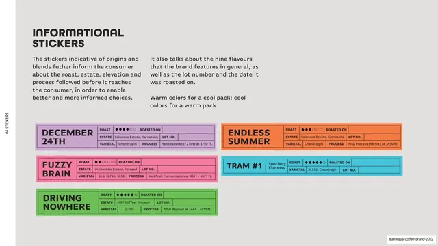
The informational sticker as a self-contained labeled grid: blend name as the big anchor on the left, a compact ROAST/ESTATE/VARIETAL/PROCESS table on the right, all in one solid color block. It packs a lot of product data into a tidy, on-brand label.
Reuse notes
Reusable for any product brand that must put spec data on pack (coffee, spirits, supplements). The name-left / table-right sticker is directly liftable. The roast-level diamonds are a neat compact rating device. Keep the table fields and type weights consistent across blends.
From this deck: Applications sticker typography
View deck


More like this




Keep what you find
A free account saves references to boards and can send you a weekly email of picks based on what you save.
To see every result, go Pro.