Preview image. Unlock full-res
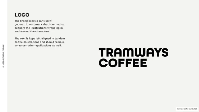
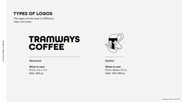
Light-grey logo page with a left-column rationale and the large black stacked "TRAMWAYS COFFEE" wordmark shown at right.
Summary
The logo page: a short rationale at left and the black stacked "TRAMWAYS COFFEE" wordmark shown large at right.
Visual description
Light-grey (#F5F4F2) reference ground with a vertical "02 LOGO, SYMBOL & TAGLINE" edge label. Top-left, a bold "LOGO" heading sits above two short black paragraphs explaining the geometric sans wordmark and its left-aligned setting. The right-center holds the wordmark itself in black: heavy all-caps "TRAMWAYS" over "COFFEE", a rounded geometric grotesque kerned tight.
Key takeaway
The grey reference-page template: bold heading and a two-paragraph rationale pinned left, the artifact shown large and clean on the right. The neutral grey switches the eye from "brand color" mode into "specification" mode without changing the type system.
Reuse notes
Reusable as the standard logo-presentation page in a brand guideline. The left-text / right-artifact split is the deck's recurring spec layout; keep it consistent across logo, color, and type pages. Grey ground keeps focus on the mark.
From this deck: Logo wordmark rationale
View deck



More like this







Keep what you find
A free account saves references to boards and can send you a weekly email of picks based on what you save.
To see every result, go Pro.