Preview image. Unlock full-res
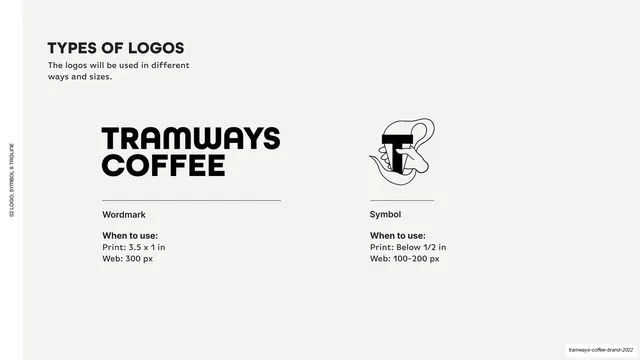
Light-grey page comparing the wordmark and the line-art symbol side by side with "when to use" print and web sizing under each.
Summary
A logo-variants page presenting the wordmark and the symbol mark side by side, each with print and web usage sizes.
Visual description
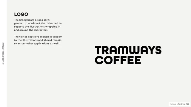
Light-grey (#F5F4F2) ground, vertical "02 LOGO, SYMBOL & TAGLINE" edge label. A bold "TYPES OF LOGOS" heading and one-line intro sit top-left. Below, two columns: the black stacked "TRAMWAYS COFFEE" wordmark on the left, the line-art "T" monogram symbol (a stylised hand holding a cup, built around a black T) on the right. Each sits above a short hairline rule, a label ("Wordmark" / "Symbol"), and a bold "When to use:" block with print and web sizes (e.g. "Print: 3.5 x 1 in / Web: 300 px").
Key takeaway
Presenting each logo variant in a matching column unit, mark over hairline rule over a "when to use" sizing note, so usage guidance reads as a clean two-up comparison. The hairline rule under each mark gives the spec a tidy baseline.
Reuse notes
Reusable logo-system page for showing primary and secondary marks with usage rules together. Scales to more columns if there are more variants. The hairline-rule-plus-label unit is a clean, repeatable component for any spec grid.
From this deck: Types of logos wordmark and symbol
View deck


More like this





Keep what you find
A free account saves references to boards and can send you a weekly email of picks based on what you save.
To see every result, go Pro.