Preview image. Unlock full-res
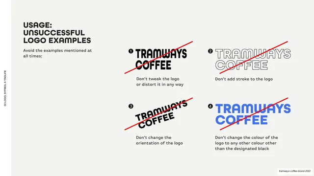
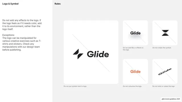
Light-grey page showing four prohibited logo treatments in a 2x2 grid, each struck through with a red diagonal line and captioned.
Summary
A logo-misuse page presenting four prohibited treatments in a 2x2 grid, each crossed out with a red diagonal.
Visual description
Light-grey (#F5F4F2) ground, vertical edge label. Top-left, a bold "USAGE: UNSUCCESSFUL LOGO EXAMPLES" heading and a short intro. The right side holds a 2x2 grid of numbered wrong examples of the wordmark, each struck through with a single red diagonal line: (1) distorted/stretched, (2) outline stroke added, (3) rotated/tilted, (4) recolored blue. Each has a short caption below: "Don't tweak the logo or distort it in any way", "Don't add stroke to the logo", "Don't change the orientation", "Don't change the colour... other than the designated black".
Key takeaway
The classic misuse grid done cleanly: numbered offenders, one consistent red strike-through, a single plain caption each. Pairing it directly opposite the "do" page makes the rules unambiguous.
Reuse notes
Reusable "don't" page for any logo guideline. Keep the strike color and caption format consistent and limit to the four or so most common abuses. Mirror the layout of the matching "do" page for a clean spread.
From this deck: Unsuccessful logo usage examples
View deck





More like this






Keep what you find
A free account saves references to boards and can send you a weekly email of picks based on what you save.
To see every result, go Pro.