Preview image. Unlock full-res
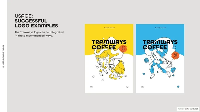
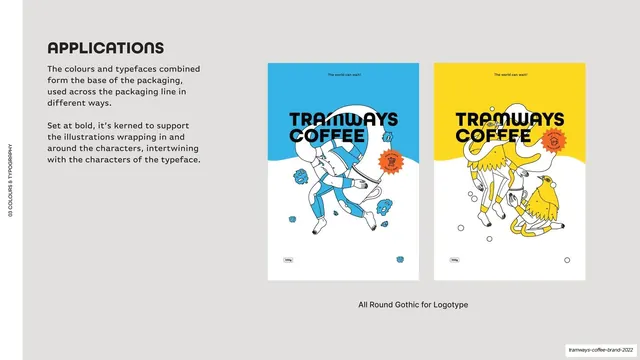
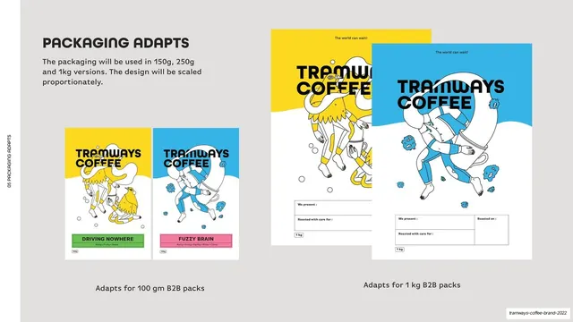
Light-grey page showing two upright pack/poster mockups (yellow and blue) demonstrating approved ways to integrate the logo with illustrations.
Summary
An approved-usage page showing two pack/poster mockups where the logo integrates with the illustration system.
Visual description
Light-grey (#F5F4F2) ground, vertical edge label. Top-left, a bold "USAGE: SUCCESSFUL LOGO EXAMPLES" heading and a one-line intro. The right two-thirds shows two upright poster-format mockups side by side: a yellow one and a blue one, each with a small "The world can wait!" line up top, the black "TRAMWAYS COFFEE" wordmark, a whimsical black-line illustration (figures, birds, a cup) wrapping through the letters, an orange sunburst sticker, and a "250g" tag at the bottom. The lower half of each pack is white where the illustration sits.
Key takeaway
Demonstrating approved logo usage on real product mockups rather than abstractly, so the rule (illustration may wrap in and around the wordmark) is shown in context. Pairing the same layout in two brand colors proves the system flexes.
Reuse notes
Reusable "do" page for showing a logo living correctly on real applications. Most persuasive when the mockups match the brand's actual packaging format. Sits opposite the "don't" page; keep the two visually parallel.
From this deck: Successful logo usage examples
View deck


More like this



Keep what you find
A free account saves references to boards and can send you a weekly email of picks based on what you save.
To see every result, go Pro.