Preview image. Unlock full-res
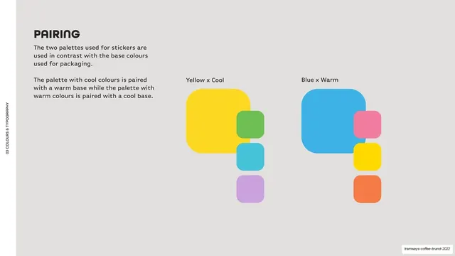
Light-grey page showing two pairing diagrams, a large base swatch (yellow, then blue) flanked by its contrasting flavour swatches, labeled "Yellow x Cool" and "Blue x Warm".
Summary
A color-pairing page showing how the warm and cool sticker palettes pair against the opposite base color.
Visual description
Light-grey (#F5F4F2) ground, vertical edge label. Top-left, a bold "PAIRING" heading and two short paragraphs stating the rule (cool palette on a warm base, warm palette on a cool base). The right side shows two diagrams labeled "Yellow x Cool" and "Blue x Warm": each is one large rounded base swatch (yellow, then blue) with a vertical stack of three smaller contrasting flavour swatches tucked against its right edge (greens/cyans/purples against yellow; pinks/yellows/oranges against blue).
Key takeaway
Visualising a pairing rule as a big-base-swatch-plus-stacked-accents diagram rather than a sentence, so the warm/cool logic is read instantly. Labeling each combination ("Yellow x Cool") makes the rule memorable.
Reuse notes
Reusable for any brand whose palette has base colors plus a contrasting accent set. The base-plus-stacked-accents motif is a clean way to show approved combinations. Most useful when there is a real pairing logic to communicate, not just a flat list of colors.
From this deck: Colour pairing rules
View deck







More like this








Keep what you find
A free account saves references to boards and can send you a weekly email of picks based on what you save.
To see every result, go Pro.