Preview image. Unlock full-res
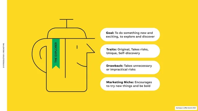
Yellow slide with a line-art coffee-press-as-head illustration on the left and four white pill cards defining the Explorer archetype on the right.
Summary
A yellow page defining the brand archetype as "The Explorer" through a line-art illustration and four labeled cards.
Visual description
Full-bleed yellow (#FED925) with a vertical "01 INTRODUCTION / ARCHETYPE" edge label. The left half holds a thin black line-art illustration that merges a French-press/coffee pot with a human profile head; a small green vertical ribbon banner reading "THE EXPLORER" hangs across it. The right half stacks four rounded white pill cards, each with a bold lead-in and roman body: "Goal:", "Traits:", "Drawback:", "Marketing Niche:". A clean split between drawing and definition.
Key takeaway
The split of a single conceptual line illustration against a stack of labeled white pill cards, which turns an abstract brand-archetype framework into something concrete and scannable. The little green ribbon naming the archetype is a nice focal hook on the drawing.
Reuse notes
Reusable for archetype, persona, or single-concept framework slides where one illustration anchors a short set of attributes. The white pills lift legibility off a strong background color. Needs a custom illustration to carry the left half; a stock icon would weaken it.
From this deck: Brand archetype The Explorer
View deck





More like this






Keep what you find
A free account saves references to boards and can send you a weekly email of picks based on what you save.
To see every result, go Pro.