Preview image. Unlock full-res
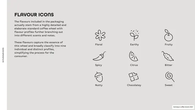
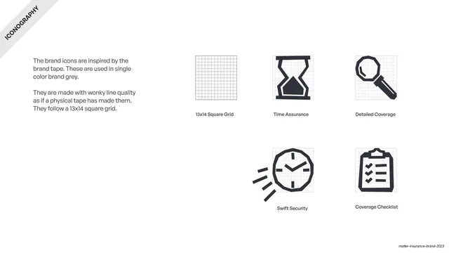
Light-grey page presenting nine thin-line flavour icons in a 3x3 grid (Floral, Earthy, Fruity, Spicy, Citrus, Bitter, Nutty, Chocolatey, Sweet).
Summary
The iconography page: nine simplified line icons that classify the brand's flavour profiles.
Visual description
Light-grey (#F5F4F2) ground, vertical edge label. Top-left, a bold "FLAVOUR ICONS" heading and two short paragraphs explaining the icons distil a detailed coffee wheel into nine profiles. The right two-thirds holds a 3x3 grid of thin black line icons, each captioned below: Floral (flower), Earthy (sprout), Fruity (apple), Spicy (chilli), Citrus (lemon wedge), Bitter (leaf), Nutty (acorn), Chocolatey (broken bar), Sweet (lollipop). Consistent single-weight line style across all nine.
Key takeaway
Reducing a complex taxonomy (a full coffee flavour wheel) to a tight nine-icon set in one consistent line weight, so flavour reads instantly on pack. The plain 3x3 grid with captions is the clearest way to present an icon family.
Reuse notes
Reusable iconography page for any brand that needs a small, legible icon set tied to a classification. Keep the line weight and corner style uniform so the set feels cohesive. The captioned 3x3 grid is the standard, reliable layout for showing an icon system.
From this deck: Flavour icons set
View deck









More like this






Keep what you find
A free account saves references to boards and can send you a weekly email of picks based on what you save.
To see every result, go Pro.