Preview image. Unlock full-res
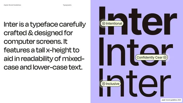
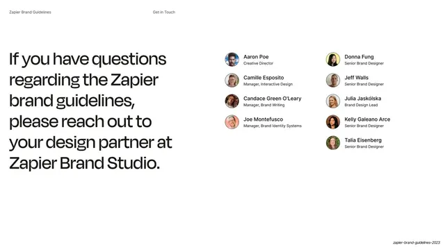
Secondary-typeface slide pairing a statement about Inter at left with a stacked "Inter" specimen and trait pills on a lavender panel at right.
Summary
A secondary-typeface slide: a statement about Inter at left and a large stacked "Inter / Inter / Inter" specimen on a lavender panel at right, tagged with trait pills.
Visual description
Split layout: white left half, lavender (#C1B7FF) right panel. The running header reads "Zapier Brand Guidelines" and "Typography". At left, a large near-black passage describes Inter as "a typeface carefully crafted & designed for computer screens... a tall x-height to aid in readability of mixed-case and lower-case text." At right, the word "Inter" is set very large in near-black and stacked three times. Small pale-yellow pill labels with plus-icons overlap the specimen: "Intentional", "Confidently Cear" (sic), and "Inclusive".
Key takeaway
Presenting the body typeface with a big repeated specimen and overlaid trait pills that attach brand personality words directly to the letterforms. The pills turn a plain specimen into an annotated, opinionated one.
Reuse notes
A reusable layout for documenting a secondary or UI typeface: statement on one side, hero specimen with personality tags on the other. Note the visible typo ("Cear") in the source capture; reproduce the layout idea, not the typo. Pairs with the following slide that breaks Inter into its weight family.
From this deck: Inter for screen readability
View deck







More like this







Keep what you find
A free account saves references to boards and can send you a weekly email of picks based on what you save.
To see every result, go Pro.