Preview image. Unlock full-res
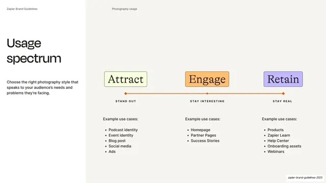
Photography-usage slide mapping an Attract / Engage / Retain spectrum across a horizontal axis at left and right, each stage tinted and given example use cases.
Summary
A photography-strategy slide: an "Usage spectrum" headline at left and a horizontal Attract / Engage / Retain axis at right, each stage tinted, sub-labeled, and given a list of example use cases.
Visual description
Split layout: white left third over a pale off-white (#F2F1EC) right two-thirds. The running header reads "Zapier Brand Guidelines" and "Photography usage". At left, an oversized two-line "Usage spectrum" headline sits above a short Inter paragraph about choosing photography that speaks to the audience. At right, three tinted boxes sit along a horizontal orange axis with end arrows: "Attract" on Bolt-yellow, "Engage" on peach, "Retain" on lavender, each set in a serif face, with small all-caps sub-labels beneath ("STAND OUT", "STAY INTERESTING", "STAY REAL"). Below each, an "Example use cases:" list: Attract (Podcast identity, Event identity, Blog post, Social media, Ads); Engage (Homepage, Partner Pages, Success Stories); Retain (Products, Zapier Learn, Help Center, Onboarding assets, Webinars).
Key takeaway
Framing photography choices as a left-to-right spectrum (attract to retain) rather than a flat set of rules, with each stage tinted, given a two-word ethos, and mapped to concrete surfaces. It tells a team not just what the styles are but where each one belongs in the funnel.
Reuse notes
A reusable model for any imagery or content-strategy slide that varies by funnel stage or audience intent. The axis-plus-use-cases structure scales to more or fewer stages. The serif stage labels echo the deck's occasional serif accent.
From this deck: Photography usage spectrum
View deck








More like this






Keep what you find
A free account saves references to boards and can send you a weekly email of picks based on what you save.
To see every result, go Pro.