Preview image. Unlock full-res
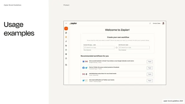
Product slide pairing a "Usage examples" headline at left with a clean Zapier app screenshot in a framed window at right.
Summary
A product slide: a "Usage examples" headline at left and a framed screenshot of the Zapier web app, headed "Welcome to Zapier!", at right.
Visual description
Split layout: white left third over a pale off-white (#F2F1EC) right two-thirds. The running header reads "Zapier Brand Guidelines" and "Product". At left, an oversized two-line "Usage examples" headline sits alone. At right, a clean framed browser-style window shows the Zapier app: a top bar with the "_zapier" wordmark, search, and "Contact Sales"; a left icon rail with an orange add button; a centered "Welcome to Zapier!" heading; a "Create your own workflow" card with two app-search inputs; and a "Recommended workflows for you" list of four rows, each with app logos, a description, and a "Try it" button.
Key takeaway
Showing the live product simply, in a single clean framed window, with only a short headline for context. After pages of type and color theory, a real interface grounds the brand in the actual product.
Reuse notes
A reusable product or screenshot slide for a guideline or sales deck. Keeping the headline minimal and letting one well-cropped, legible app capture carry the slide is the move. Needs a tidy, current screenshot; stale UI dates the whole deck.
From this deck: Product usage examples
View deck








More like this




Keep what you find
A free account saves references to boards and can send you a weekly email of picks based on what you save.
To see every result, go Pro.