Preview image. Unlock full-res
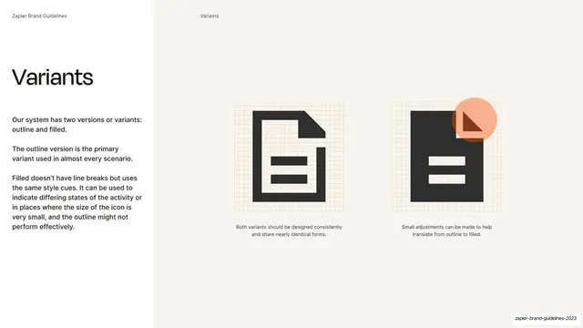
Icon-variants slide explaining the outline and filled system at left, with two large document icons on construction grids and caption notes at right.
Summary
An icon-variants slide: copy explaining the outline-and-filled system at left, with two large document icons drawn on faint construction grids and short captions beneath them at right.
Visual description
Split layout: white throughout, with a faint vertical divider. The running header reads "Zapier Brand Guidelines" and "Variants". At left, an oversized "Variants" headline sits above three Inter paragraphs explaining that the system has two versions, outline and filled, that outline is the primary variant for nearly every scenario, and that filled is used to indicate active states or where size is very small. At right, two large near-black document icons sit on faint orange construction grids: the left a clean outline document, the right a filled document with an orange circular detail at top-right. Each has a small centered caption: "Both variants should be designed consistently and share nearly identical forms." and "Small adjustments can be made to help translate from outline to filled."
Key takeaway
Documenting the two icon variants side by side on visible construction grids, with plain-language rules for when to use each. The grids signal that icons are built to a system, and the captions remove ambiguity about outline-versus-filled usage.
Reuse notes
A reusable detail slide for an icon system that ships in multiple weights or fills. The construction-grid presentation reads as rigorous and is worth keeping for any spec-level icon documentation. Keep the usage rules short and absolute.
From this deck: Icon outline and filled variants
View deck







More like this




Keep what you find
A free account saves references to boards and can send you a weekly email of picks based on what you save.
To see every result, go Pro.