Preview image. Unlock full-res
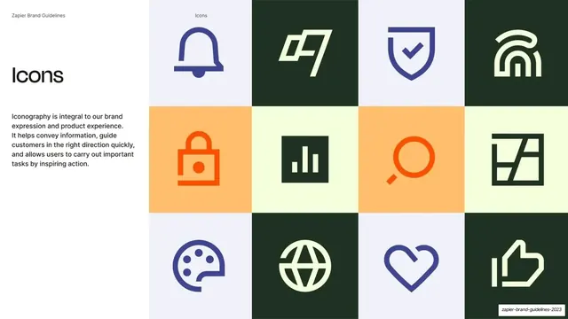
Icon-system slide with an "Icons" headline and rationale at left and a checkerboard grid of twelve two-color brand icons at right.
Summary
An iconography slide: an "Icons" headline and rationale at left, and a four-by-three checkerboard grid of twelve thick line icons at right, each on a different brand-color tile.
Visual description
Split layout: white left quarter over a multi-tile grid filling the right three-quarters. The running header reads "Zapier Brand Guidelines" and "Icons". At left, an oversized "Icons" headline sits above an Inter paragraph on iconography being integral to brand and product. At right, a four-column, three-row grid of square tiles in alternating brand colors (lavender-grey, moss-green, peach, Bolt-yellow), each holding one bold two-weight line icon: bell, flag, shield-check, fingerprint/arch, padlock, bar chart, magnifier, abstract mark, palette, globe, heart, thumbs-up. Icons are drawn in navy, green, or orange to read against their tile.
Key takeaway
Showing the icon set as a full checkerboard of colored tiles rather than a flat list, so the icons and the palette demonstrate together. The thick, geometric two-color line style reads clearly at any size and feels distinctly branded.
Reuse notes
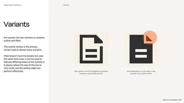
A reusable iconography overview slide. The colored-tile grid is a lively way to present an icon family while reinforcing the palette. Best when icons share a consistent stroke weight and corner style, as here. Pairs with the following slide detailing outline-versus-filled variants.
From this deck: Iconography grid
View deck











More like this






Keep what you find
A free account saves references to boards and can send you a weekly email of picks based on what you save.
To see every result, go Pro.