Preview image. Unlock full-res
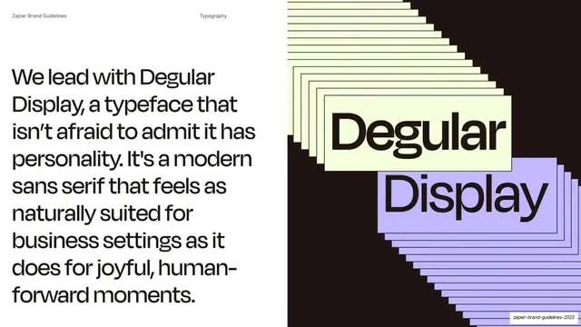
Typography intro pairing a large statement about Degular Display at left with a cascading stacked-repeat "Degular Display" specimen on black at right.
Summary
A primary-typeface introduction: a large statement about Degular Display at left and a dramatic cascading stacked-repeat specimen of the words "Degular Display" on black at right.
Visual description
Split layout: white left half, black right half. The running header reads "Zapier Brand Guidelines" and "Typography". At left, a very large near-black Degular Display passage fills the column, describing the face as "a typeface that isn't afraid to admit it has personality... a modern sans serif that feels as naturally suited for business settings as it does for joyful, human-forward moments." At right, on black, the words "Degular" (on a pale Bolt-yellow card) and "Display" (on a lavender card) are repeated and offset diagonally, cascading downward in a stacked-shadow effect so each word trails into a staircase of receding copies.
Key takeaway
Introducing the primary typeface by setting a long statement entirely in that face (showing it at work) while a cascading stacked-repeat specimen on black demonstrates its display personality. The repetition turns a static specimen into a kinetic-feeling graphic.
Reuse notes
A confident way to open a typography section: let the headline face speak for itself in body-length copy, then give it a hero specimen moment. The stacked-repeat treatment is reusable for any display face with strong forms. Works best with a face distinctive enough to carry a full paragraph at large size.
From this deck: We lead with Degular Display
View deck










More like this









Keep what you find
A free account saves references to boards and can send you a weekly email of picks based on what you save.
To see every result, go Pro.