Preview image. Unlock full-res
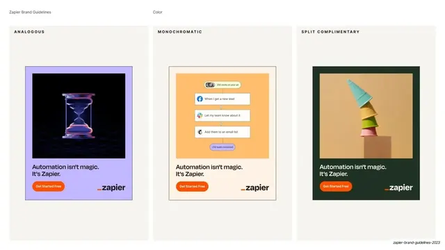
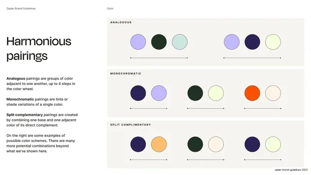
Three side-by-side vertical ad mockups demonstrating analogous, monochromatic, and split-complementary pairings applied to "Automation isn't magic" campaign creative.
Summary
A color-in-context slide: three vertical ad mockups side by side, each demonstrating one pairing rule (analogous, monochromatic, split-complementary) on the same "Automation isn't magic. It's Zapier." campaign creative.
Visual description
Three columns on an off-white (#F2F1EC) field, each headed in small all-caps: ANALOGOUS, MONOCHROMATIC, SPLIT COMPLIMENTARY. The running header reads "Zapier Brand Guidelines" and "Color". Each column holds a vertical portrait ad: the left on a lavender background with a dark image of a glowing hourglass; the center on a cream background with a peach automation-workflow card mockup; the right on a moss-green background with a photo of stacked colorful ice-cream cones. All three share the same lockup: the line "Automation isn't magic. It's Zapier.", an orange "Get Started Free" button, and the "_zapier" wordmark.
Key takeaway
Proving each color-pairing rule by applying it to one identical piece of campaign creative, so the only variable is the palette. Holding the headline, button, and logo constant makes the color differences the entire point and shows the system working in the wild.
Reuse notes
The strongest way to document color use: real mockups, not chips. Reusable whenever you want to show a palette or pairing rule in applied context. Keep the creative template fixed across variants so the comparison stays honest. Needs production-quality mockups to be convincing.
From this deck: Color pairings in campaign mockups
View deck



More like this





Keep what you find
A free account saves references to boards and can send you a weekly email of picks based on what you save.
To see every result, go Pro.