Preview image. Unlock full-res
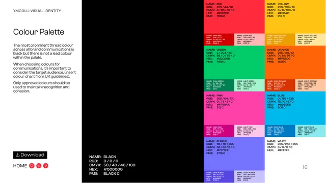
Dark swatch page documenting the full multi-hue palette with RGB, CMYK, HEX and PMS values, noting black as the most prominent thread colour.
Summary
The colour-palette page: a dense grid of saturated swatches with full RGB/CMYK/HEX/PMS values for each hue and its dark/light tints, against a black sidebar that calls black the most prominent thread colour.
Visual description
The left third is black, carrying the "YMGOLLI VISUAL IDENTITY" eyebrow, the "Colour Palette" title and three short paragraphs: black is the most prominent thread across communications but is not a lead colour; choose colours considering the target audience (referencing a UK colour chart); only approved colours should be used. The Black swatch values sit in white at the bottom of this column (RGB 0/0/0, HEX #000000, PMS Black C). The right two-thirds is a grid of large colour blocks, each with a smaller dark and light tint beside it, fully specced: Red #FF2C3D, Yellow #FFC413, Green #02CB6B, Orange #FF650C, Pink #FF40AA, Blue #00B9EB, Purple #7373FF and White #FFFFFF, each labelled with NAME, RGB, CMYK, HEX and PMS. A "Download" button sits above "HOME" bottom-left; page "16" bottom-right.
Key takeaway
Pairing each lead hue with a built-in dark and light tint in the same cell gives a ready tonal range, not just flat colours. Stating that black is the thread colour while the brights are accents resolves how such a loud palette stays usable.
Reuse notes
The reference colour page for the system; reuse the swatch-with-tints cell and four-space value block (RGB/CMYK/HEX/PMS) for print-and-digital brands. The dark sidebar lets the bright grid pop, a good pattern for colour-heavy palettes.
From this deck: Colour Palette
View deck







More like this



Keep what you find
A free account saves references to boards and can send you a weekly email of picks based on what you save.
To see every result, go Pro.