Preview image. Unlock full-res
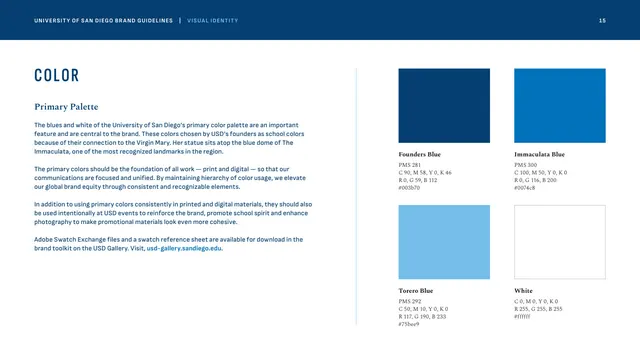
The four core brand colors, Founders Blue, Immaculata Blue, Torero Blue and white, shown as large swatches with full PMS, CMYK, RGB and hex specs.
Summary
The primary-palette page, presenting the four foundational brand colors as a 2x2 block of swatches with complete print and screen color values.
Visual description
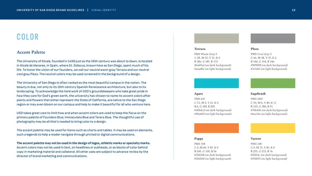
The Color chapter opens here. Left column: "COLOR" in tracked condensed Founders Blue caps, a "Primary Palette" Spectral subhead, and body copy on the blues' connection to the Virgin Mary and the Immaculata dome, ending with a bright-blue toolkit link. The right two-thirds is a 2x2 grid of large color blocks, each with a bold name and a stack of values beneath: Founders Blue (PMS 281, #003b70), Immaculata Blue (PMS 300, #0074c8), Torero Blue (PMS 292, #75bee9), and White (#ffffff, shown as an outlined empty square). The three blues descend from deep navy to light sky.
Key takeaway
A disciplined four-color core (three blues plus white) with full PMS/CMYK/RGB/hex specs is a model of restraint and reproducibility. Tying each color to brand lore (the Marian blue, the dome) gives the palette meaning beyond aesthetics. The empty outlined "white" swatch is a neat way to make white an explicit brand color.
Reuse notes
The canonical primary-color page; copy the swatch-plus-full-specs grid directly. Strong reference for any brand built on a tight monochromatic or near-monochromatic palette. Pairs with the accent-palette page that follows.
From this deck: Primary color palette
View deck





More like this





Keep what you find
A free account saves references to boards and can send you a weekly email of picks based on what you save.
To see every result, go Pro.