Preview image. Unlock full-res
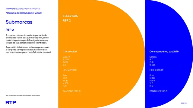
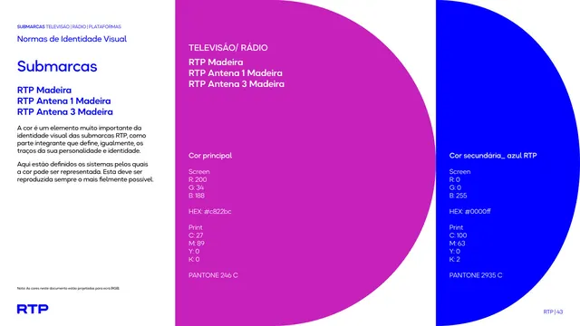
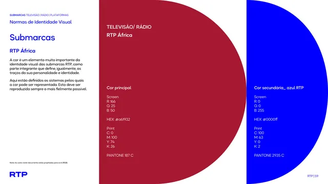
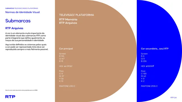
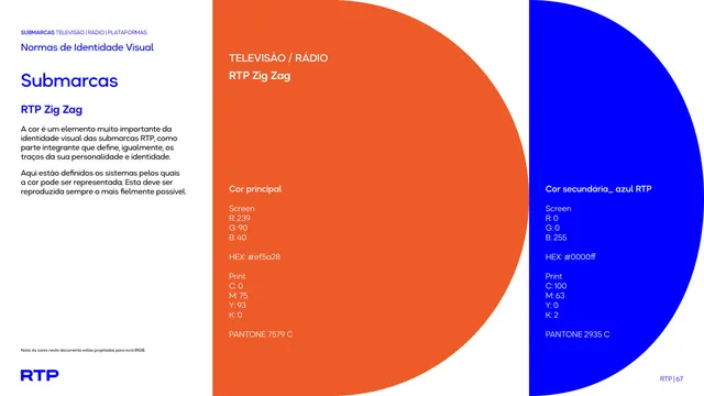
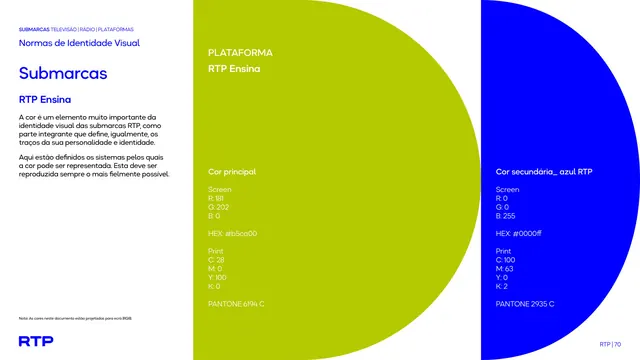
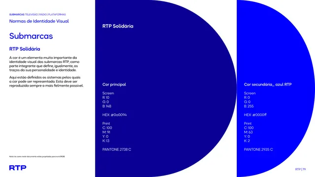
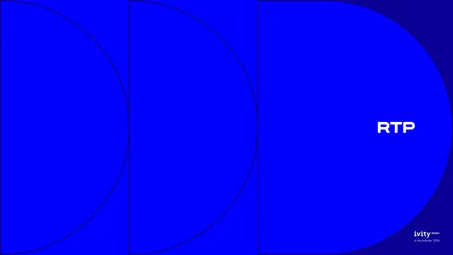
Color specification page listing all five TV/radio sub-brand names against a large red-and-blue half-circle split, with RGB, CMYK, hex, and Pantone values for each color.
Summary
A color-specification page for the TV/radio sub-brand group, listing the five station names against a large red half-circle bleeding into a blue half-circle, with full color-build values for each.
Visual description
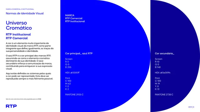
Left column on white gives a short intro paragraph on why color matters to sub-brand identity, above a heading "Televisão/ Rádio" listing RTP Notícias, RTP Antena 1, RTP Lusitânia, RTP Fado, and RTP Vida in blue bold type. The page's right two-thirds is dominated by one giant red circle overlapping a giant blue circle, their arcs crossing near the page's vertical center, echoing the half-circle motif from the cover. Over the red field sits "Cor principal" with Screen RGB, HEX #ed1c24, Print CMYK, and Pantone 485 C values. Over the blue field sits "Cor secundária_ azul RTP" with its RGB, HEX #0000ff, CMYK, and Pantone 2935 C values, all in white type.
Key takeaway
Using the brand's own circular motif at giant scale as the color-swatch device itself, rather than a plain rectangle, ties a purely technical spec page back to the identity's shape language.
Reuse notes
A strong pattern for a color-specification page when the brand has a distinctive geometric motif; scale that shape up to become the swatch. Needs precise Pantone/CMYK/RGB/hex values on hand for each color being documented.
From this deck: Sub-brand color specification, TV and radio marks
View deck