Preview image. Unlock full-res
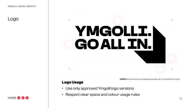
White page demonstrating the logo safe area on a marked grid with faint O markers, plus two basic usage rules.
Summary
The clear-space page: the lockup centred on a measured grid with corner crop marks and faint "O" markers showing the protected safe area, plus two usage rules.
Visual description
White background, "YMGOLLI VISUAL IDENTITY" eyebrow and "Logo" title in the left sidebar. The main area shows the "YMGOLLI. GO ALL IN." lockup with chevron shadow large and centred, framed by a light construction grid with small red "x" markers at the four outer corners and faint pink "O" shapes marking the exclusion zone. A small caption reads "ALWAYS leave safe area around logotype especially with co-branded Partner logos." Below, a "Logo Usage" subhead with two bullets: use only approved Ymgolli logo versions; respect clear space and colour usage rules. "HOME" nav bottom-left, page "13" bottom-right.
Key takeaway
Visualising the exclusion zone with the same "O" unit used on the partner page keeps the clear-space rule consistent across both. Red "x" corner markers read instantly as keep-out points.
Reuse notes
The standard exclusion-zone page; reuse the grid-plus-corner-markers diagram for any logo spec. Tying the safe-area unit to a letterform (the O) again means the rule scales with the mark.
From this deck: Logo clear space and usage
View deck






More like this





Keep what you find
A free account saves references to boards and can send you a weekly email of picks based on what you save.
To see every result, go Pro.