Preview image. Unlock full-res
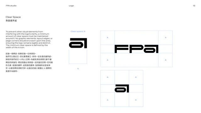
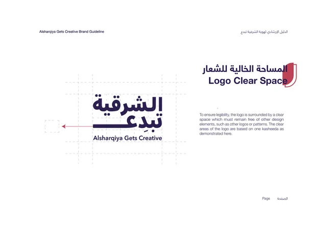
Clear-space page defining the exclusion zone around the wordmark and icon using the width of the a icon as the unit.
Summary
The clear-space rule: the minimum padding around the logo, defined by the width of the "a" icon, shown as a blue grid framing both the wordmark and the icon.
Visual description
White page. The left column explains in English and Chinese that no graphic, edge or page corner may encroach the exclusion zone, and that the minimum clear space equals the width of the A icon. The right side shows two diagrams: the FPA wordmark and the standalone "a" icon each centered inside a light-blue grid, with a small blue "A" placed in the surrounding cells to mark the one-icon-width margin on all sides. Black marks on white, blue construction lines.
Key takeaway
Using the brand's own icon as the clear-space measurement unit (rather than an abstract "x") keeps the rule self-referential and on-brand. Repeating a small blue "A" in the margin cells makes the spacing unit literal and easy to apply.
Reuse notes
A standard exclusion-zone page. Tie the clear-space unit to a logo element so it scales with the mark. Blue grid lines keep it consistent with the rest of the technical diagrams.
From this deck: Logo clear space
View deck


























More like this





Keep what you find
A free account saves references to boards and can send you a weekly email of picks based on what you save.
To see every result, go Pro.