
Preview image. Unlock full-res
Brand guidelines for a Himalayan wellness brand built on an emerald-green, cream, and cobalt-blue palette, a serif display wordmark, and an intricate blue line-art crest.
Summary
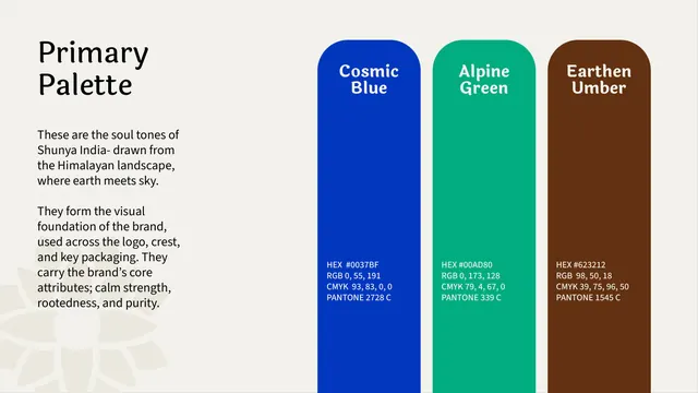
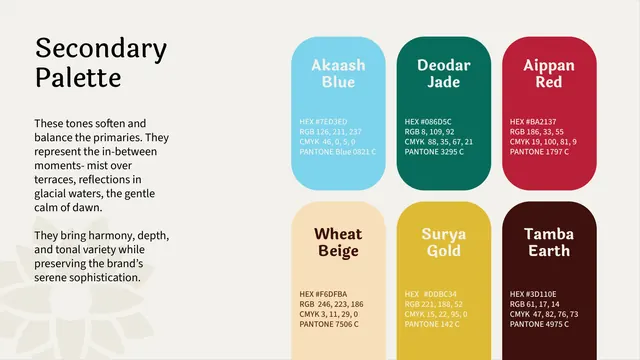
A wellness brand guideline for Shunya India that pairs deep Himalayan storytelling with a clean editorial system: an emerald-green and cream base, a cobalt-blue accent, a curvy serif display wordmark, and an ornate single-color crest that recurs throughout.
Visual description
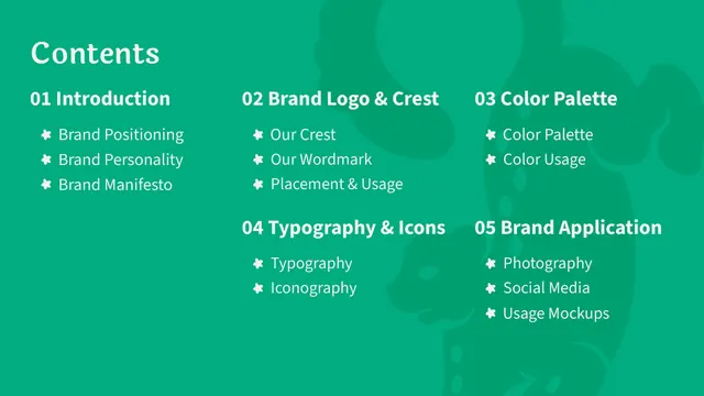
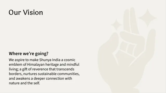
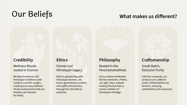
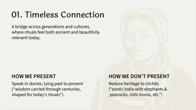
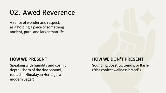
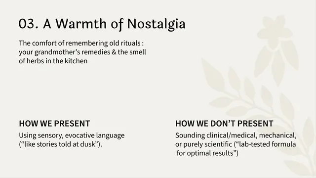
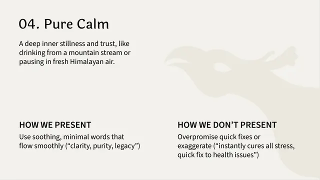
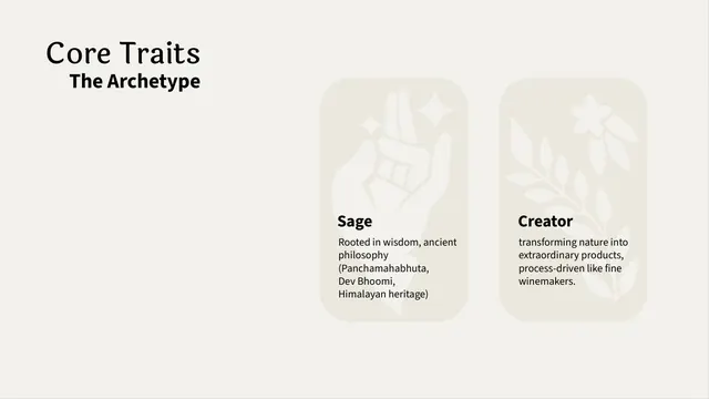
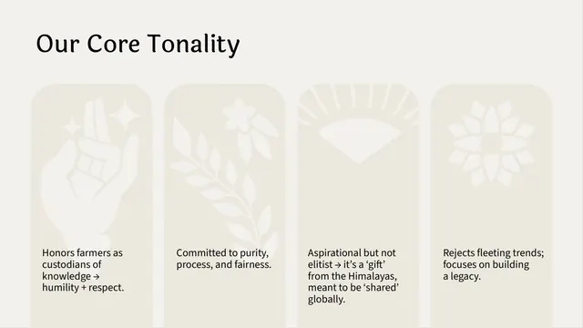
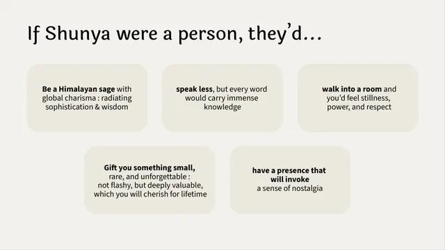
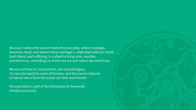
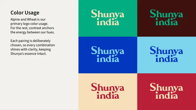
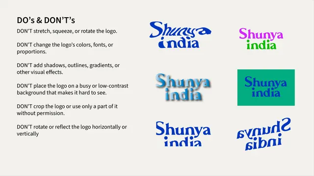
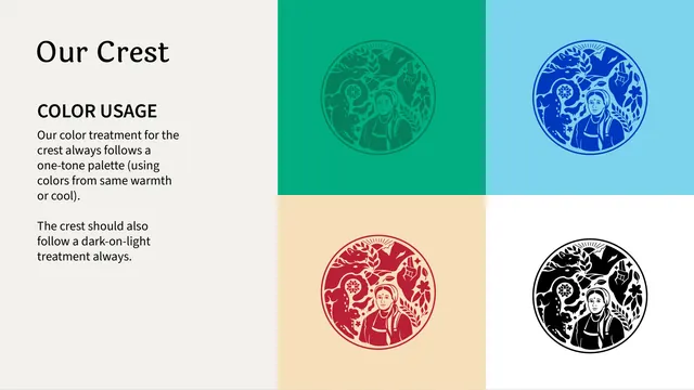
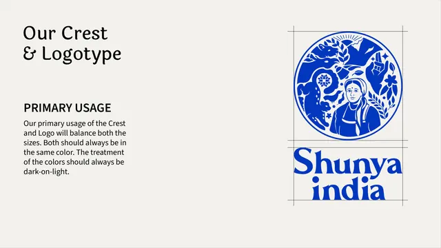
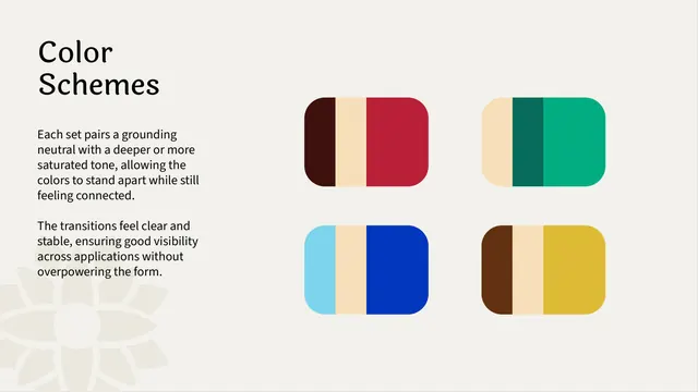
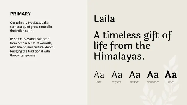
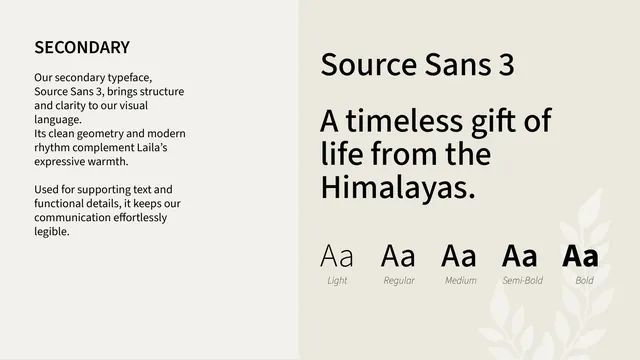
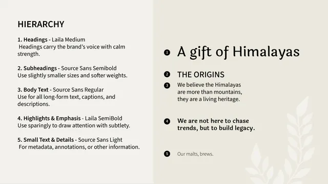
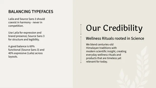
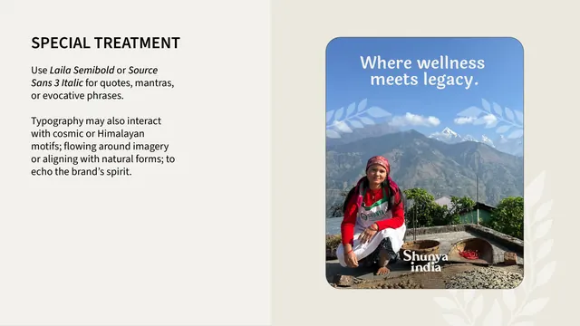
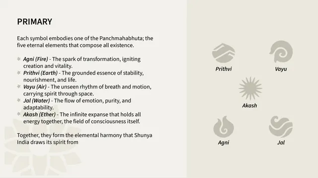
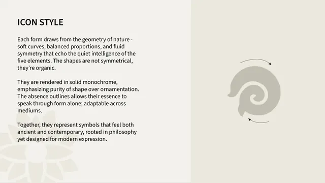
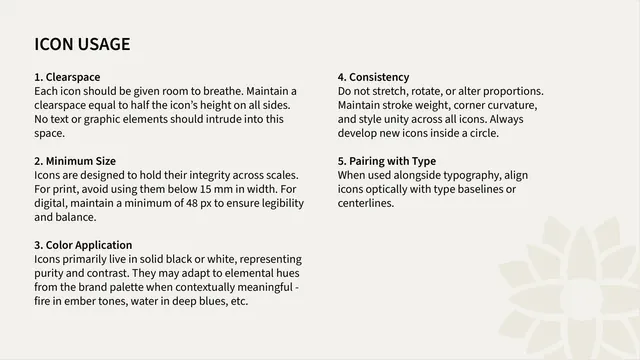
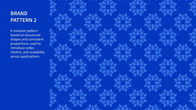
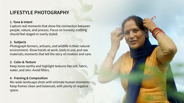
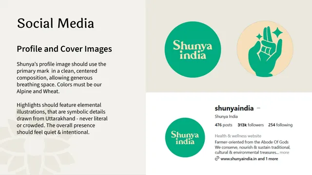
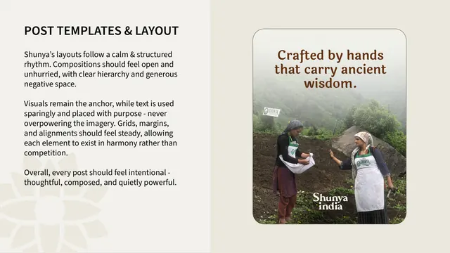
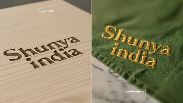
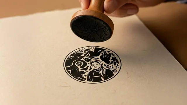
The deck runs on a tight two-mode color system. Section dividers and manifesto pages use a saturated emerald green with the cream wordmark and oversized faint background line-art (a coiled snow leopard, hand mudra, nature motifs). Content pages flip to a warm off-white (cream) background with near-black sans-serif body copy and large soft beige illustrations bled to the right. Full-bleed Himalayan landscape and farmer photographs act as breathers between sections, each carrying the wordmark in cream or cobalt. Type is a two-family pairing: a rounded, slightly quirky serif display face for headings and the wordmark, set against a neutral humanist sans-serif for body and labels. The signature asset is a circular crest rendered as flat blue line-art, packing a Uttarakhand farmer woman, snow leopard, musk deer, Monal bird, Brahma Kamal flower, rising sun, mountains, and a hand mudra into one seal; the brand pages isolate each motif by filling it solid cobalt while the rest stays pale blue. Recurring decorative bits include a four-petal asterisk bullet and rounded-rectangle "tablet" cards holding line icons. The logo appears in cobalt, cream, and red across green, dark-maroon, sky-blue, and wheat backgrounds.
Key takeaway
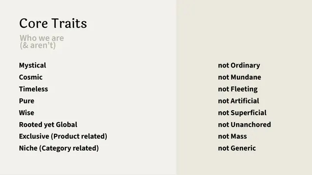
The crest-as-system: one dense illustrated seal that gets decomposed page by page, each sub-element spotlighted in the accent color over a muted version of the whole. The disciplined two-mode flip between vivid green dividers and calm cream content keeps a long deck legible without going monotone. The "How we present / How we don't present" two-column tone-of-voice spreads are a clean, copyable way to pin down brand voice.
Reuse notes
Strong reference for heritage, wellness, ayurvedic, or artisanal food and lifestyle brands that need warmth and craft without kitsch. The decompose-the-emblem technique works for any brand with a detailed mascot or seal. Note the palette leans rich and earthy, so it pairs best with real photography and generous whitespace; the curvy display serif is characterful and may fight with very technical or corporate contexts.
From this deck: Shunya India brand guidelines
View deck











































More like this




Keep what you find
A free account saves references to boards and can send you a weekly email of picks based on what you save.
To see every result, go Pro.