Preview image. Unlock full-res
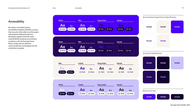
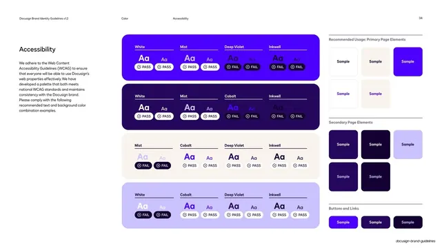
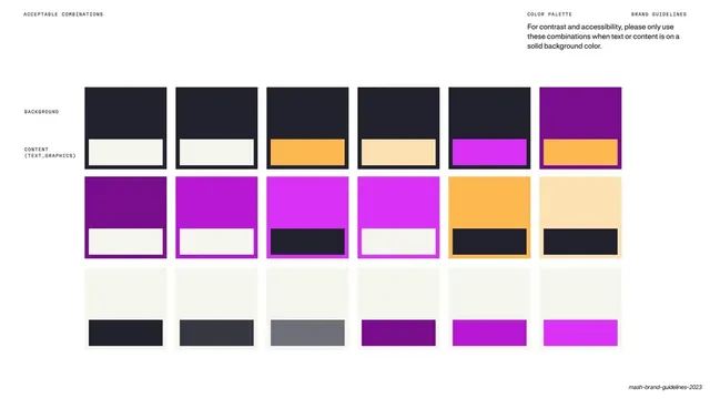
Accessibility page testing text-on-color combinations as four stacked color blocks of Aa swatches tagged PASS or FAIL, with a recommended-usage column on the right.
Summary
An accessibility reference page that turns WCAG contrast testing into a visual matrix: four large rounded color blocks, each holding several "Aa" text swatches stamped with a PASS or FAIL pill.
Visual description
Standard guideline layout on white. Left column holds the heading "Accessibility" and a paragraph about adhering to WCAG. The center hosts four stacked, large rounded-corner blocks in the brand colors (cobalt, deep violet, near-black inkwell, light lavender mist). Inside each block, text labels (White, Mist, Cobalt, Deep Violet, Inkwell) sit above paired "Aa" samples; each sample carries a small rounded pill reading PASS (white pill, check icon) or FAIL (dark pill, x icon). A right-hand column titled "Recommended Usage" shows three labeled groups, Primary Page Elements, Secondary Page Elements, and Buttons and Links, as small "Sample" chips, each separated by a hairline rule. The running header reads "Docusign Brand Identity Guidelines v1.2 / Color / Accessibility / 34".
Key takeaway
Encoding pass/fail contrast results directly onto the swatches with binary pills makes an abstract accessibility rule instantly scannable. Stacking one color per block keeps a dense data set legible.
Reuse notes
A strong template for any brand or design-system page that needs to communicate which text-on-background pairings are allowed. Reuse the PASS/FAIL pill pattern in component libraries and accessibility audits. Works best with a tightly defined palette so the matrix stays a manageable size.
From this deck: Accessibility color-pairing pass/fail matrix
View deck











More like this


Keep what you find
A free account saves references to boards and can send you a weekly email of picks based on what you save.
To see every result, go Pro.