Preview image. Unlock full-res
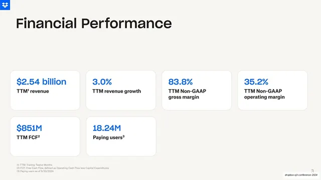
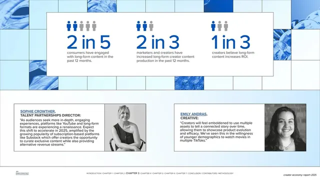
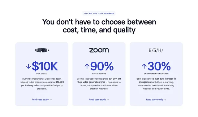
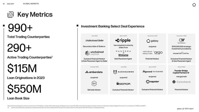
Cream KPI slide with six white rounded cards, each pairing a large blue figure with a small black label, under an oversized heading.
Summary
A KPI dashboard slide: six white rounded cards laid out four-up then two-up, each leading with a large blue metric over a small black caption, under an oversized "Financial Performance" heading.
Visual description
Warm cream (#F5F2ED) background with the blue Dropbox box mark top-left. An oversized black "Financial Performance" heading sits upper-left. Below, six white soft-cornered cards: a top row of four ("$2.54 billion / TTM revenue", "3.0% / TTM revenue growth", "83.8% / TTM Non-GAAP gross margin", "35.2% / TTM Non-GAAP operating margin") and a second row of two ("$851M / TTM FCF", "18.24M / Paying users"). Each card pairs a large bright-blue figure with a bold black label beneath. Three small grey footnotes run along the bottom-left defining TTM, FCF and the paying-users date. A page number sits bottom-right.
Key takeaway
The two-tier hierarchy inside each card: the number in the loud accent blue, the descriptor small and black underneath, so the eye scans figures first and reads context second. White cards floating on cream give soft separation without hard borders.
Reuse notes
A reliable pattern for an earnings highlights or traction slide where six-ish headline numbers need equal billing. Works best when figures are short; long values break the alignment. Footnotes parked at the bottom keep the cards clean. The single accent color carries the whole page, so pick it well.
From this deck: Financial Performance metric cards
View deck








More like this




Keep what you find
A free account saves references to boards and can send you a weekly email of picks based on what you save.
To see every result, go Pro.