Preview image. Unlock full-res
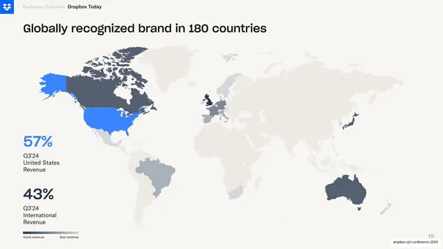
World-map metrics slide with a headline on global reach, a shaded revenue choropleth, and two stacked US-versus-international revenue percentages with a legend.
Summary
A geography slide that fills the canvas with a shaded world map and overlays two large revenue-split percentages, using a single blue highlight to call out the United States.
Visual description
A cream full-bleed slide with the Dropbox blue logo and "Business Overview / Dropbox Today" header at top-left. A bold one-line headline reads "Globally recognized brand in 180 countries". Below it a near-full-width world map is rendered as a choropleth: most countries sit in pale grey-beige, key markets (Canada, the UK, Australia, parts of Europe and Japan) deepen to dark slate, and the United States is filled in bright Dropbox blue to read as the lead market. Overlapping the map at lower left, two oversized stacked percentages each pair a number with a small grey caption: "57% Q3'24 United States Revenue" in blue and "43% Q3'24 International Revenue" in dark slate. A small "more revenue / less revenue" gradient legend sits beneath them. Page number bottom-right.
Key takeaway
Letting a full-bleed shaded map carry the slide while a single saturated brand color (here Dropbox blue on the US) does all the highlighting against muted greys. The two big stacked percentages turn the map into a revenue-split story instead of decoration.
Reuse notes
A clean pattern for showing geographic reach or a market revenue split on one page. The choropleth needs a real intensity scale and a legend to be honest about what the shading means. Best when one or two markets deserve a highlight color; if many regions matter, the single-accent trick stops working.
From this deck: Global brand revenue choropleth map
View deck





More like this






Keep what you find
A free account saves references to boards and can send you a weekly email of picks based on what you save.
To see every result, go Pro.