Preview image. Unlock full-res
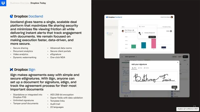
Split slide stacking two products, Dropbox DocSend and Dropbox Sign, as paragraph plus two-column bullets on cream at left against overlapping product UI mockups on near-black at right.
Summary
A denser feature slide that stacks two products in one frame: DocSend on top and Sign below on the cream left, each with a paragraph and a two-column bullet list, against a cluster of overlapping product mockups on the black right.
Visual description
The same cream-left, near-black-right split, but worked harder. The left column carries two product blocks stacked vertically. The upper block leads with a "Dropbox DocSend" lockup (blue icon, blue product word), a paragraph on deal-room file sharing and analytics, then a two-column bullet grid (secure sharing, document analytics, video analytics, dynamic watermarking on the left; advanced data rooms, secure client portals, eSignature, one-click NDA on the right). The lower block repeats the pattern with "Dropbox Sign", a paragraph on simple secure eSignatures, and a two-column bullet grid (standalone or integrated, unlimited signatures, tamper-proof, plus AES 256-bit encryption, signer fields, template links, audit trail, 22 languages). On the right, several light UI panels overlap on the black: a DocSend analytics dashboard with a small colored bar chart and a search popover, and a "Client Agreement" document view with an "Add your signature" modal showing a handwritten signature. Header top-left, page number bottom-right.
Key takeaway
Packing two related products into one slide by giving each its own branded lockup, paragraph, and two-column bullet grid, while letting their UIs overlap as a single layered stack on the dark side. The two-up bullet columns hold a lot of feature detail without feeling like a list dump.
Reuse notes
Reach for this when two products or modules must share a slide and you want them to read as a suite rather than separate pages. Information-dense, so it suits an investor or analyst audience that wants depth; trim the bullets for a wider room. The overlapping mockups imply a connected workflow but get busy fast, so keep the front-most panel clearly dominant.
From this deck: DocSend and Sign two-product feature
View deck




More like this





Keep what you find
A free account saves references to boards and can send you a weekly email of picks based on what you save.
To see every result, go Pro.