Preview image. Unlock full-res
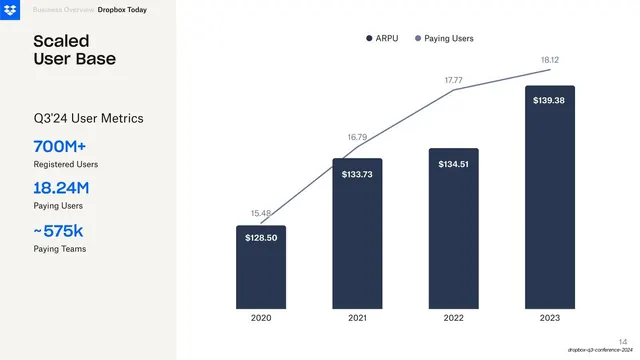
Metrics slide pairing a left rail of stacked headline KPIs with a combined bar-and-line chart of ARPU and paying users from 2020 to 2023.
Summary
A clean metrics slide where a narrow cream KPI rail on the left frames the takeaway and a large combined bar-plus-line chart on the right shows ARPU rising against growing paying users across four years.
Visual description
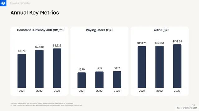
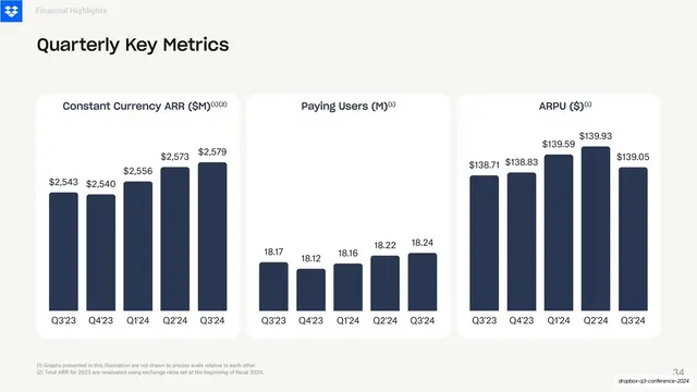
The slide returns to a fully cream background. Top-left the Dropbox blue logo sits beside the "Business Overview / Dropbox Today" header. A left rail stacks a bold two-line title "Scaled User Base", a small label "Q3'24 User Metrics", then three big KPIs in bright Dropbox blue, each with a grey caption beneath: "700M+ Registered Users", "18.24M Paying Users", and "~575k Paying Teams". The right two-thirds holds a combo chart: four dark navy columns labeled 2020 to 2023, each carrying a white in-bar dollar value (128.50, 133.73, 134.51, 139.38), with a grey-blue ARPU line climbing across them above grey data labels (15.48, 16.79, 17.77, 18.12) and a small "ARPU / Paying Users" legend up top. Faint horizontal gridlines, no heavy axes. Page number bottom-right.
Key takeaway
Splitting a data slide into a "so what" rail and a "here's the data" chart: the oversized colored KPIs deliver the headline numbers instantly while the combo chart carries the trend behind them. The in-bar value labels and minimal gridlines keep the chart readable without axis clutter.
Reuse notes
Ideal for an earnings, board, or investor slide that must land a few hero metrics and one growth trend on the same page. The blue-on-cream KPIs read as the summary; reserve the chart for the supporting story. Works best when the KPI count stays around three so the rail does not crowd.
From this deck: Scaled User Base combo chart
View deck