
Preview image. Unlock full-res
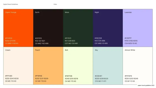
Full color palette page with named swatch blocks for brights, darks, neutrals, and text colors, each listing HEX, RGB, CMYK, and Pantone.
Summary
The brand palette page: named color blocks grouped into brights/darks, neutrals, and text, each swatch printed with its HEX, RGB, CMYK, and Pantone values.
Visual description
Standard page chrome ("Color" / "Brand Palette", page "29"). The left column heading "Brand Palette" runs over a paragraph naming Cobalt as primary with Inkwell, Deep Violet, White, Mist secondary and Poppy as a sparing accent. The right two-thirds is a bento grid of color blocks labeled along the left edge ("Brights and Darks", "Neutrals", "Text"). The top section holds large blocks for Cobalt (#4C00FF), Inkwell (#130032), Mist (#CBC2FF), Deep Violet (#26065D), and Poppy (#FF5252); the middle row holds White (#FFFFFF) and Ecru (#F8F3F0); the bottom strip shows four "Aa" tiles for primary/secondary text on dark and light. Every block prints its color name and full HEX/RGB/CMYK/Pantone spec.
Key takeaway
A bento of differently-sized swatches, grouped and labeled by role (brights/darks, neutrals, text), encodes hierarchy into the layout itself, so the primary color reads as primary by size. Putting all four color systems on each swatch makes it production-ready.
Reuse notes
The canonical palette page for any brand guideline. Directly reusable: size the swatches by importance, group by role, and always print HEX/RGB/CMYK/Pantone plus dedicated text-color tiles.
From this deck: DocuSign brand palette swatches
View deck




































































































More like this







Keep what you find
A free account saves references to boards and can send you a weekly email of picks based on what you save.
To see every result, go Pro.