Preview image. Unlock full-res
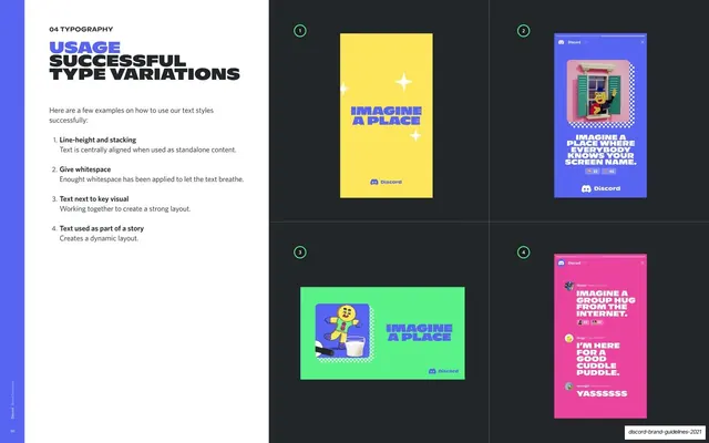
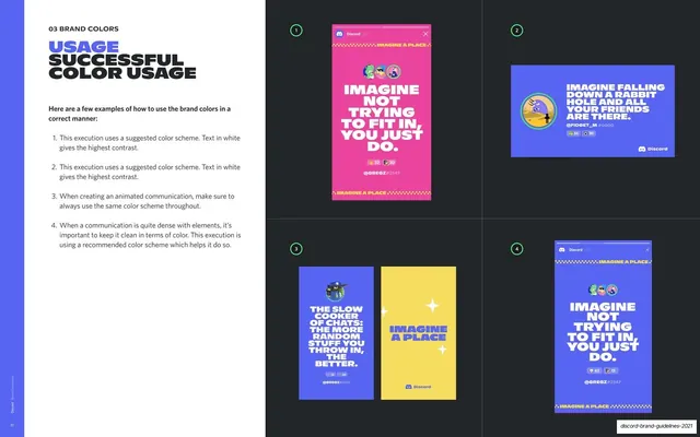
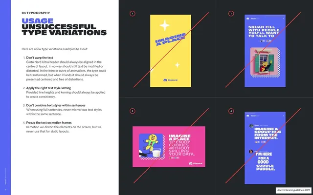
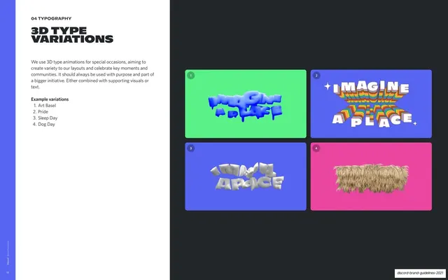
Four correct type-in-layout executions as colorful social mockups (yellow, blurple, green, chat thread) beside a numbered left rationale.
Summary
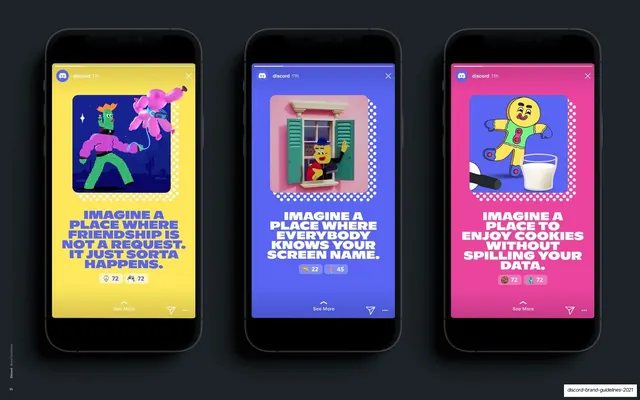
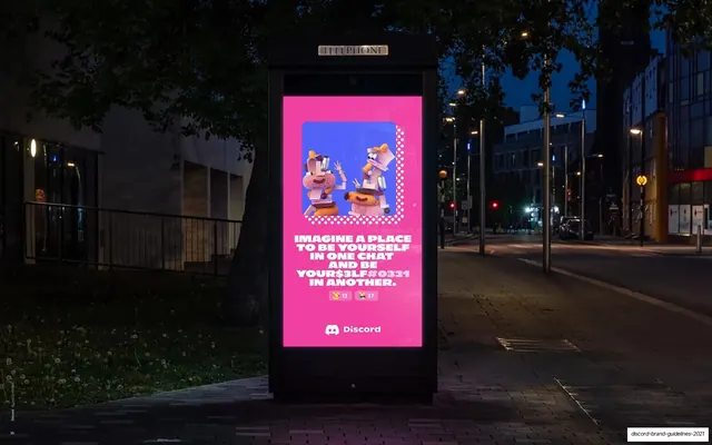
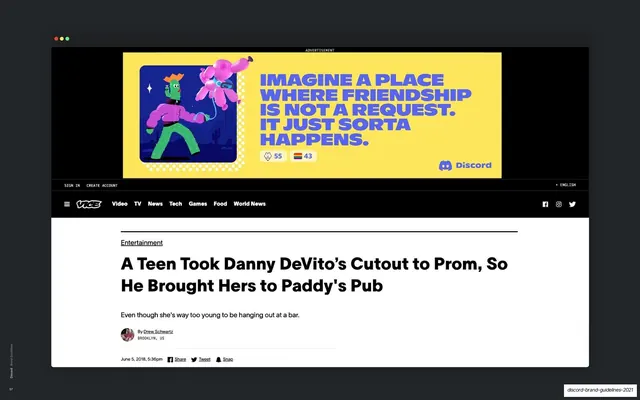
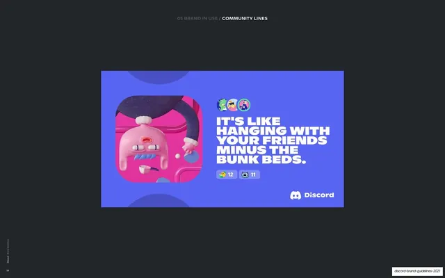
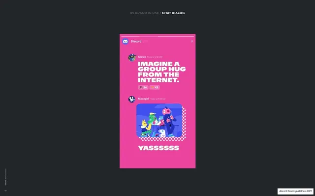
A do-page for type in real layouts: four colorful social mockups demonstrate good type variations, standalone centered text, text under a key visual, text beside a visual, and text as part of a chat story.
Visual description
White-left / near-black-right split. The left column shows the "04 TYPOGRAPHY" eyebrow, a stacked two-tone "USAGE / SUCCESSFUL TYPE VARIATIONS" headline, and a four-point numbered rationale (line-height and stacking; give whitespace; text next to key visual; text used as part of a story). The right 2x2 grid holds four mockups, each tagged green: a yellow vertical story with centered blurple "Imagine a Place" and sparkles, a blurple vertical post with an illustrated window scene above a headline and reaction pills, a green horizontal card with an illustration left and blurple headline right, and a fuchsia chat thread stacking three avatared messages in alternating white and blurple type. Each demonstrates one of the listed type behaviours.
Key takeaway
Proving the type system across genuinely different formats and colors in one grid, so the styles read as flexible rather than rigid. The green markers tie each lively example back to a dry rule, balancing energy with discipline.
Reuse notes
The positive half of a do/don't spread (the facing page strikes the failures in red). A good reference for showing a type system performing in-context across stories, cards, and threads. Needs real illustration and color to sell it; the chat-thread mockup is platform-specific.
From this deck: Successful type variations
View deck





More like this


Keep what you find
A free account saves references to boards and can send you a weekly email of picks based on what you save.
To see every result, go Pro.