Preview image. Unlock full-res
Light governance-diversity page with one white card of three donut charts (gender and age) above two cards of large-number veteran and disability stat rows.
Summary
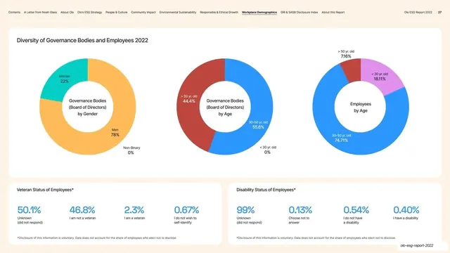
A governance-diversity page combining a top card of three donut charts (board by gender, board by age, employees by age) with two lower cards of oversized-number stat rows for veteran and disability status.
Visual description
Warm off-white background, persistent top navigation (page 27). A wide rounded white card, "Diversity of Governance Bodies and Employees 2022", holds three donut charts in a row: Governance Bodies by Gender (Men 78% amber, Women 22% teal), Governance Bodies by Age (red and blue split), and Employees by Age (blue dominant with amber and magenta wedges), each with a centered label and percentage callouts. Below sit two equal white cards: "Veteran Status of Employees" and "Disability Status of Employees", each a row of four oversized blue percentage figures (50.1%, 46.8%, 2.3%, 0.67% and 99%, 0.13%, 0.54%, 0.40%) with small captions and a voluntary-disclosure footnote.
Key takeaway
Stacking a row of small-multiple donuts over a row of big-number stat blocks so one page carries both proportional breakdowns and standout single figures without clutter. The oversized colored percentages turn dry self-disclosure data into confident, scannable highlights.
Reuse notes
Effective for a diversity or workforce page that needs several proportional splits plus a few headline stats. Three donuts in a row is about the limit for legibility at this size. The big-number stat row is a reusable component for any "key figures" strip elsewhere in a report.
From this deck: Diversity of Governance three donuts and stat rows
View deck












More like this






Keep what you find
A free account saves references to boards and can send you a weekly email of picks based on what you save.
To see every result, go Pro.