Preview image. Unlock full-res
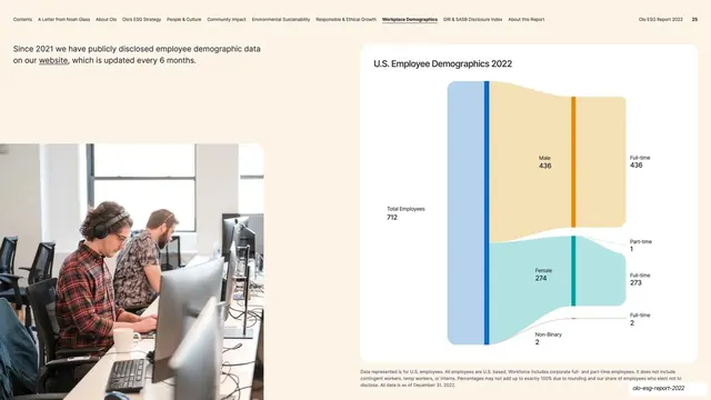
Light demographics page with a full-bleed office photo bottom-left and a large white card holding a colored Sankey flow diagram of US employees by gender and work status.
Summary
A demographics page presenting US employee data as a colored Sankey flow diagram inside a large white card, paired with a full-bleed office photo in the lower-left corner.
Visual description
Warm off-white (#FBF1E6) background, persistent top navigation (page 25). A short intro line top-left notes employee demographic data is published every six months. Below it, a photograph of two people working at desktop monitors in an open office bleeds off the bottom-left corner. The right two-thirds is a large rounded white card titled "U.S. Employee Demographics 2022" containing a Sankey diagram: a single "Total Employees 712" node flows into Male/Female/Non-Binary bands (blue, teal, thin) that fan out into Full-time and Part-time endpoints, each labeled with a count. A small grey footnote runs along the bottom of the card.
Key takeaway
Using a Sankey flow to show how a single headcount splits across two dimensions (gender, then work status) in one readable ribbon, rather than two separate charts. Letting a documentary office photo bleed off one corner warms up an otherwise analytical page and ties the data to real people.
Reuse notes
A good reference for any report page that explains a population breaking down across stages or categories (headcount, funnel, budget allocation). The Sankey needs enough volume difference between bands to read clearly; tiny segments (Non-Binary, Part-time here) get thin and hard to label. Keep the card framing so it matches sibling data pages.
From this deck: US Employee Demographics Sankey card
View deck








More like this





Keep what you find
A free account saves references to boards and can send you a weekly email of picks based on what you save.
To see every result, go Pro.