Preview image. Unlock full-res
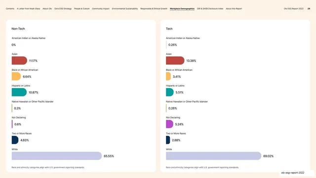
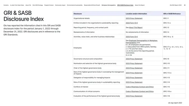
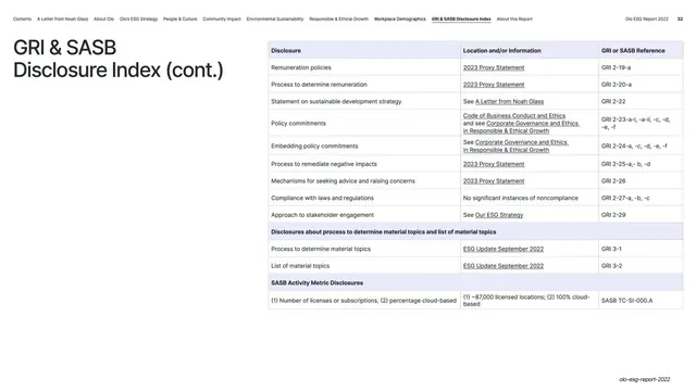
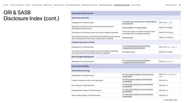
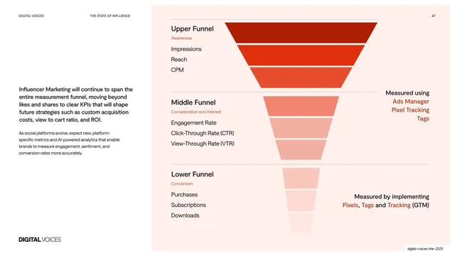
Light demographics page placing two identical racial/ethnic horizontal-bar lists side by side, Non-Tech versus Tech, for direct comparison.
Summary
A comparison page setting two identical racial/ethnic horizontal-bar lists side by side, "Non-Tech" on the left and "Tech" on the right, so the two workforce segments can be read against each other line by line.
Visual description
Warm off-white background, persistent top navigation (page 29). Two equal rounded white cards sit side by side with matching headers, "Non-Tech" and "Tech". Each lists the same eight racial/ethnic categories in the same order (American Indian, Asian, Black, Hispanic, Native Hawaiian, Not Declaring, Two or More Races, White), each a short colored horizontal bar scaled to its percentage with the value to the right, and both close with the same "align with U.S. government reporting standards" note. White dominates both (65.55% vs 69.02%); the smaller categories differ subtly between columns.
Key takeaway
Repeating one chart component identically in two columns so comparison is purely a matter of scanning across at the same row, with no new visual language to learn. Same scale, same order, same colors is what makes the side-by-side honest and instant.
Reuse notes
The cleanest pattern for an A-vs-B comparison of the same metric set (two segments, two periods, two products). Demands that both sides share axis, ordering, and color exactly. Reuses this report's standard racial/ethnic bar-list card, keeping it consistent with the surrounding demographic pages.
From this deck: Non-Tech vs Tech racial/ethnic comparison
View deck





















More like this





Keep what you find
A free account saves references to boards and can send you a weekly email of picks based on what you save.
To see every result, go Pro.