Preview image. Unlock full-res
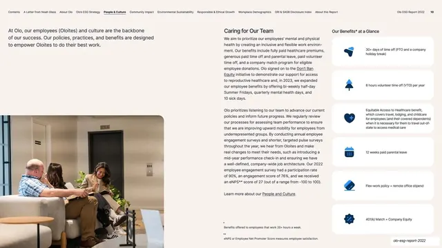
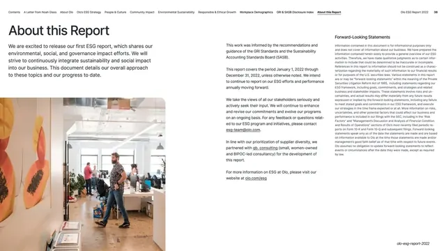
Caring for Our Team page with intro and a candid photo on the left, two columns of benefits copy center, and a right rail of white benefit cards with icons.
Summary
The team-care page: an intro and a candid lounge photo on the left, two columns of benefits copy in the center, and a right rail of white "Our Benefits at a Glance" cards with icons.
Visual description
Near-white page with running nav and page number "10". The left column opens with a bold intro line, then drops to a candid photo of colleagues talking on a couch that fills the lower-left. The center holds the "Caring for Our Team" section in two columns of small black body copy with a few inline links. The right rail, headed "Our Benefits at a Glance", stacks white rounded cards, each a blue duotone icon beside a short benefit ("30+ days of time off", "8 hours volunteer time off per year", "Equitable Access to Healthcare benefit...", "12 weeks paid parental leave", "Flex-work policy + remote office stipend", "401(k) Match + Company Equity"), with two asterisked footnotes at the bottom.
Key takeaway
The right-rail benefit card stack running alongside narrative copy: the body explains, the cards summarize the concrete perks. It lets a reader skim the rail for the takeaways or read the prose for the detail. The lower-left candid photo warms the page without taking a full column.
Reuse notes
A strong template for a benefits, perks, or "how we treat our people" page. The icon card rail is reusable wherever you want a scannable summary beside explanatory text. Keep card labels short; this works because each is a single phrase.
From this deck: Caring for Our Team benefits
View deck




More like this





Keep what you find
A free account saves references to boards and can send you a weekly email of picks based on what you save.
To see every result, go Pro.