Preview image. Unlock full-res
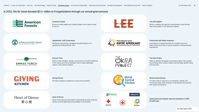
Grant-recipients page led by a single bold headline stat, then a two-column grid of white cards each pairing a nonprofit logo with a one-line description.
Summary
The grant-recipients page: a single bold headline stat across the top, then a two-column grid of white cards, each pairing a nonprofit's logo with a one-line description of its mission.
Visual description
Near-white page with running nav and page number "15". A bold headline runs across the top: "In 2022, Olo for Good donated $2.1+ million to 9 organizations through our annual grant process". Below, a two-column grid of white rounded cards, five rows deep. Each card holds a nonprofit's full-color logo on the left and a short mission descriptor on the right ("American Forests", "The LEE Initiative", "Appalachian Trail Conservancy", "Partnership with Native Americans", "Emma's Torch", "The Okra Project", "Giving Kitchen", "World Central Kitchen", "Heart of Dinner"); the final card groups several smaller logos under a "Social justice and disaster response donations" line.
Key takeaway
The logo-plus-one-line card repeated down two columns: a clean, credible way to list grant recipients or partners where each gets a real logo and a sentence of context. Leading with the headline donation figure frames the whole grid as proof of that number.
Reuse notes
Reusable as a partners, grantees, or portfolio-of-organizations page. The two-column logo-and-text card scales to a dozen-plus entries cleanly. Logos will vary wildly in shape and color, so the equal white cards and fixed text column are what keep it orderly.
From this deck: Olo for Good grant recipients
View deck

More like this







Keep what you find
A free account saves references to boards and can send you a weekly email of picks based on what you save.
To see every result, go Pro.