Preview image. Unlock full-res
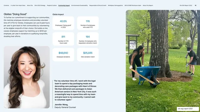
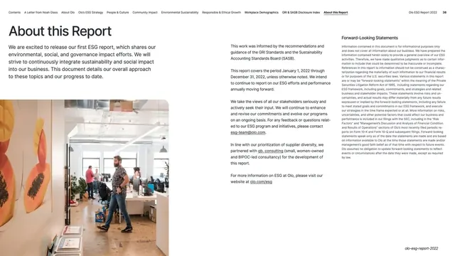
Volunteering page with intro and a portrait plus pull-quote on the left, a 2x3 grid of stat cards in the center, and a full-height outdoor volunteer photo on the right.
Summary
The volunteering metrics page: intro copy with a portrait and pull-quote on the left, a 2x3 grid of blue stat cards in the center, and a full-height outdoor volunteer photo on the right.
Visual description
Near-white page with running nav and page number "16". The left column has the "Oloites 'Doing Good'" heading and a paragraph, then a portrait of a smiling woman over a bold pull-quote attributed to "Jennifer Wong, Deputy General Counsel". The center is an "Oloite Impact" 2x3 grid of white rounded cards, each showing a large blue stat over a small label ("40.5% Employees 'doing good' in 2022", "176 Number of employees who used VTO", "811 Number of VTO hours used", "164 Number of employees who requested a donation match", "$48,640 Employee donations", "$25,935 Olo's donation match"). A full-height photo of two people gardening with a wheelbarrow fills the right third.
Key takeaway
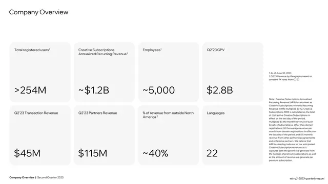
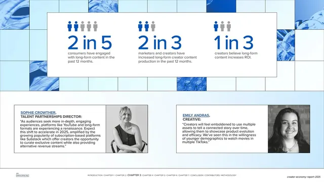
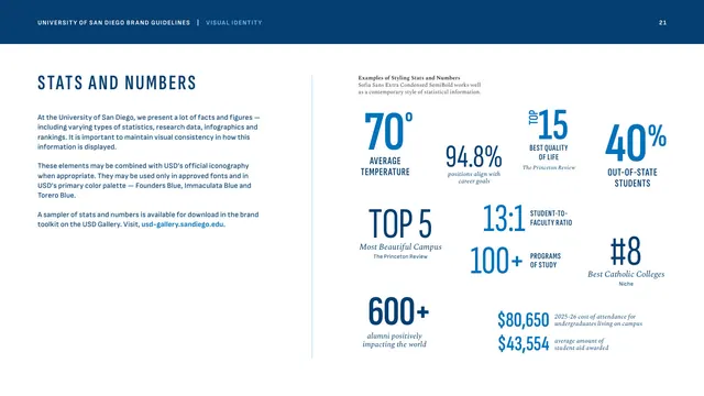
The 2x3 stat-card grid with the number set large in brand blue and a tiny descriptor beneath: a punchy way to report a program's results at a glance. Flanking it with a quoted portrait on one side and an action photo on the other turns dry metrics into a human story.
Reuse notes
A reusable "results / by the numbers" page for any program recap. The big-number stat card is the workhorse component; keep the descriptor to one short line. Six stats fit comfortably; more would need smaller cards or a second row.
From this deck: Oloites Doing Good metrics
View deck



More like this




Keep what you find
A free account saves references to boards and can send you a weekly email of picks based on what you save.
To see every result, go Pro.