Preview image. Unlock full-res
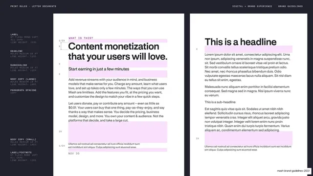
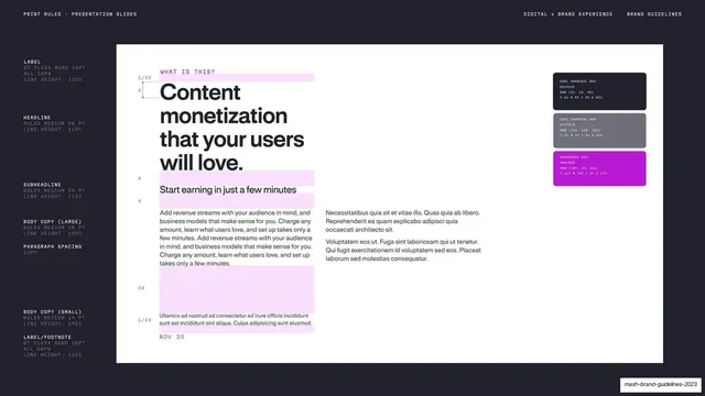
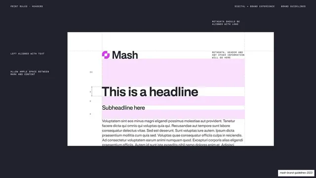
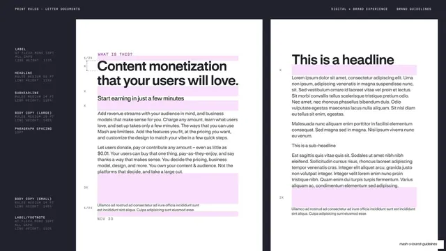
Dark spread comparing two white letter-document layouts side by side, both annotated with type roles in the margin and pink spacing boxes over the copy.
Summary
A print-rules page placing two white letter-document layouts side by side on a dark spread, both annotated with type tiers down the left margin and pink spacing boxes over the running copy.
Visual description
Near-black charcoal background holding two tall white document mockups side by side. A tiny mono header reads "PRINT RULES - LETTER DOCUMENTS" left, "DIGITAL + BRAND EXPERIENCE" center-right, "BRAND GUIDELINES" right. The dark left margin specs each tier in mono (LABEL GT Flexa Mono 16pt; HEADLINE Rules Medium 56pt; SUBHEADLINE 24pt; BODY COPY large 18pt and small 14pt; paragraph spacing 10pt). The left sheet leads with a black "Content monetization that your users will love." headline, subhead and two body blocks; the right sheet leads with "This is a headline" over lorem body and a sub-headline. Both wrap key text in pale-pink highlight boxes with x and 3X spacing markers; small mono footnotes and dates sit at the bottom of each. The deck slug sits tiny at bottom-right.
Key takeaway
Showing two variants of the same document standard side by side so the rules read as a flexible system rather than a single fixed layout, while a shared margin spec and pink-box spacing language keep both on the same grid.
Reuse notes
Rounds out the print-rules trio (slide, header, letter) for templated collateral. Reach for the side-by-side framing when you want to prove a layout system flexes across content. Documentation, not a presentation slide; keep the two examples genuinely different to justify the pairing.
From this deck: Letter document print rules, two layouts
View deck









































More like this







Keep what you find
A free account saves references to boards and can send you a weekly email of picks based on what you save.
To see every result, go Pro.