Preview image. Unlock full-res
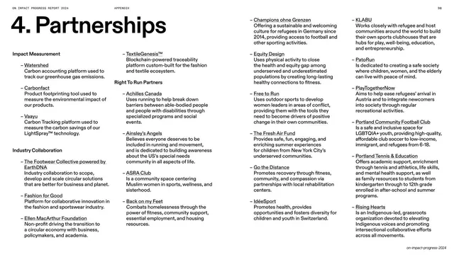
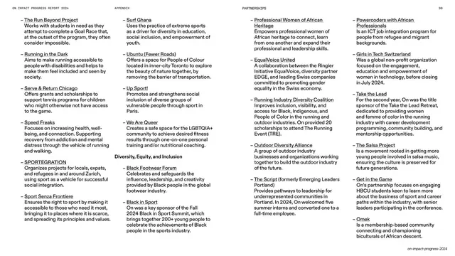
A white appendix opener pairing an oversized "Partnerships" headline with a dense five-column directory of partner organizations, each a bold name over a one-line description.
Summary
The partnerships opener: an oversized numbered headline at top-left over a dense five-column list of partner organizations, each entry a dash, a bold name, and a short description.
Visual description
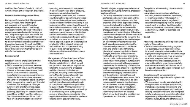
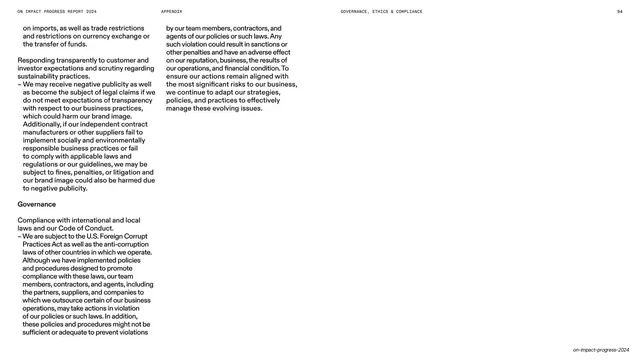
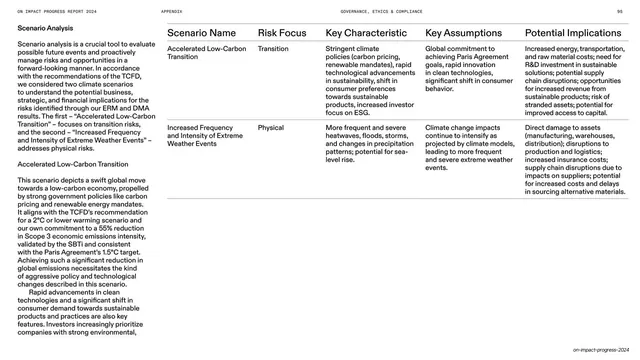
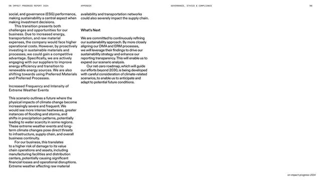
White page. The thin all-caps header runs across the top: "ON IMPACT PROGRESS REPORT 2024" left, "APPENDIX" center, page number "98" right. An oversized one-line headline in heavy black sans-serif, "4. Partnerships", sits top-left. Below it the page becomes a five-column directory grouped by bold category labels ("Impact Measurement", "Industry Collaboration", "Right To Run Partners", "Equity Group"). Each partner is a list item: a leading en-dash, the organization name in bold, then a one or two line plain description beneath. Items stack tightly down each column and flow across all five. No images, logos, rules, or color. Muted footer bottom-right.
Key takeaway
Turning a long partner roster into a designed directory with a strict dash-plus-bold-name-plus-blurb micro-pattern repeated across five columns. It packs dozens of named partners onto one page while staying scannable, and the big numbered headline keeps it tied to the report's section system.
Reuse notes
Excellent for partner lists, sponsor rosters, member directories, glossaries, or any "many short named entries" content in a report or appendix. The repeating dash/bold/blurb unit is easy to extend to a second page (as this deck does) without redesign. Keep descriptions to one or two lines so columns stay even. Monochrome and type-only, so it leans on a clear bold weight to separate names from descriptions.
From this deck: Partnerships section opener with directory list
View deck




















































More like this





Keep what you find
A free account saves references to boards and can send you a weekly email of picks based on what you save.
To see every result, go Pro.